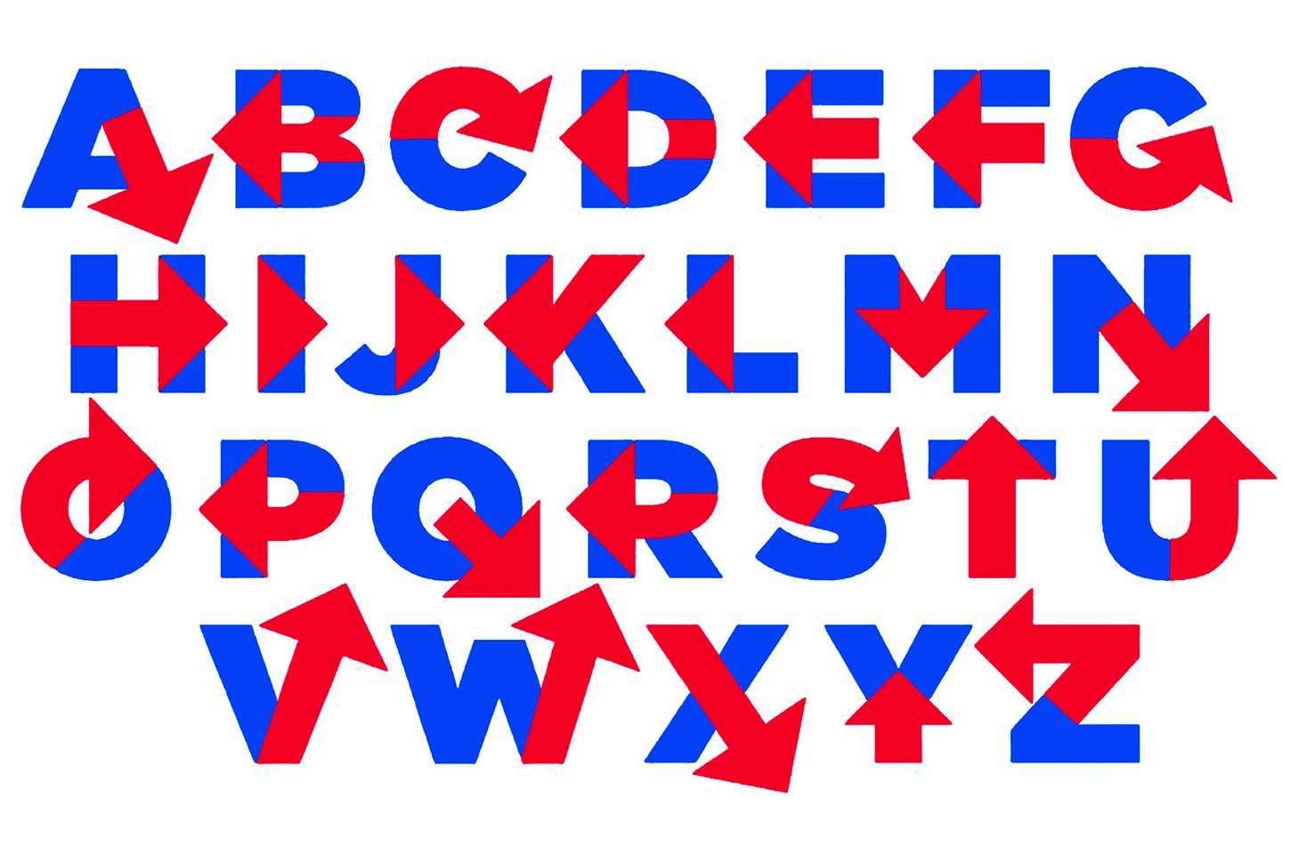
Hillvetica

On Sunday, April 12, Hillary Clinton debuted her presidential campaign logo: a letter H shot through with a red arrow. Parallels were immediately drawn to everything from hospital signage to the Cuban flag to the storefront of a U.K. grocery chain.
But one man saw more. The next day, designer Rick Wolff turned out a rough sketch of a font based on the logo, which he named "Hillvetica," after the popular font Helvetica.
Wolff tweeted a picture of the alphabet, then—when the demand for a useable version of the font became clear—a quick note asking which of the crowdsourcing platforms would work best to raise a few hundred bucks to turn his drawings into a computer-readable font using the Glyphs app. He quickly settled on GoFundMe, and pulled down the needed cash in a matter of hours.
And so the expensive, ponderously designed campaign logo was felled by the forces of crowdsourced satire in 72 hours. Too bad we'll all still be staring at the logo for the next 500 days—and quite possibly the following four years.
This article originally appeared in print under the headline "Hillvetica."

