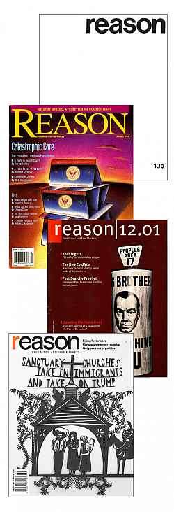
New Year, New Logo at Reason!
2018 marks the 50th anniversary of Reason and we're celebrating with a typographical facelift.

If you look to the upper left-hand corner of this page or to the bottom of the image to the right, you'll notice something different: a new Reason logo.
New year, new logo, right? Subscribers to the electronic edition of Reason have already gotten the news (please join them by signing up for a year of the magazine of "Free Minds and Free Markets" for as little as $14.95).
Our new logo combines elements the one that we debuted in December of 2001 and our original logo that debuted in 1968, the year Reason began publishing. Designed by our art director Joanna Andreasson in conjunction with Reason magazine's Editor in Chief Katherine Mangu-Ward, I hope you agree that the new logo—which we'll be using across all our platforms (print, online, video, podcasting)—is pretty damn swell.
New logos are like new hairstyles: They're almost always overdue and they're almost always a marked improvement of whatever they're replacing (not always, almost always). I know that as the editor in chief of this site, I'm especially happy to add something new to our legacy of online logos.
Here's a quick summary: In the early days of the web, we pursued a tried-and-true strategy of simply copying our print mag's logo and slapping Online on it, so there would be no confusion between the print and cyberspace editions! This iteration lasted from our launch circa 1994 through our first print redesign in decades, which happened in 2001.
We got a great new logo as part of our 2001 redesign, overseen by Wired co-founder Louis Rossetto, who brought in Erik Spiekermann and Susanna Dulkinys to radically change the look and feel of our print mag. We still felt a need to differentiate the online content by reminding web readers that they were in fact online and not reading a paper-and-ink publication. This version kept the faith until 2008.
We reskinned the site in 2008 and 2009 and decided to take the (obvious step) of using our site logo as a reminder of our URL (how else would you know where you were?). That said, we also felt a need to make it pop by mocking it up on a piece of paper that was draped on top of the site's design elements.
In 2010, we kept the ".com" extension but reduced the size of the logo to allow more space to be given to our content. Which makes sense. Readers generally knew where they were.
And now, we're happy to unveil our latest and greatest website (and magazine!) logo so far:
Hope you enjoy it.
2018 marks the 50th anniversary of Reason, and we'll be celebrating throughout the year by calling attention to the last half-century of prescient journalism we produced while laying out a vision of a glorious libertarian future in which people are free to pursue happiness as they define it. Through it all, we'll remain loyal to the founding ideals articulated by Lanny Friedlander (1947-2011) in our very first issue:
Introducing REASON: We accept the responsibility that others have defaulted on. Others preferred to smear the issues with irrelevancies and falsifications. We don't. Others preferred to be incomprehensible and incoherent. We don't. Others preferred to ignore your mind. We won't.
When REASON speaks of poverty, racism, the draft, the war, student power, politics, and other vital issues, it shall be reasons, not slogans, it gives for conclusions. Proof, not belligerent assertion. Logic, not legends. Coherance [sic], not contradictions. This is our promise; this is the reason for REASON.
Reason is published by the Reason Foundation, a 501(c)3 nonprofit. Donations are tax free, so if you're looking to redirect some money from Uncle Sam and toward an organization fighting to reduce the size, scope, and spending of government and to increase individual freedom and flourishing, please think about making a year-end gift.

