This Chart Shows How Much Freedom the World Has Won and Lost Since 1972
Looking at Freedom House's data from the perspective of individuals instead of states

Every year the human rights group Freedom House puts out a paper assessing how free each nation of the world is. You can quibble with its judgments in many individual cases, but overall it gives you a good sense of where people do or don't enjoy basic civil liberties and political rights.
It isn't immediately obvious what way is best to put all that data together. Freedom House tells us which countries are getting better or worse, but some countries are much bigger than others. How many individuals live under relatively free or unfree regimes?
Jay Ulfelder, a political scientist who blogs at Dart-Throwing Chimp, has taken a stab at an answer. He has published a chart showing the world's levels of liberty and self-government, as measured by Freedom House, from 1972 to 2014 (with a gap in 1981, when the group started publishing its data on a different schedule). The chart looks at the world as a whole, converting the individual states' scores into a single global figure weighted by population, with shifts in big countries moving the line more than shifts in little ones. If we want to approach this topic "from a classical liberal perspective," Ulfelder explains, "then individual people, not states, need to be our unit of observation."
On Ulfelder's scale, the freest possible Planet Earth would get a score of 10 and a prison world would get a 0. Here are his results:
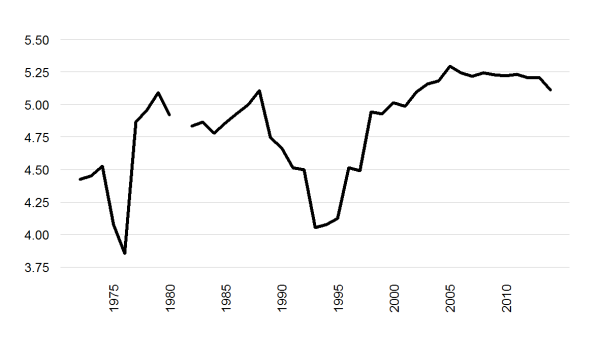
Not what you were expecting, is it? "At first I thought I must have messed up the math, because everyone knows things got a lot better when Communism crumbled in Eastern Europe and the Soviet Union, right?" Ulfelder writes. "It turns out, though, that those swings are driven by changes in China and India, which together account for approximately one-third of the global population." China's Freedom House score worsened after the Tienanmen Square massacre of 1989, then improved a bit in 1998; India got somewhat less free in the early '90s, then freer a few years later.
Ulfelder also notes that the line has been close to flat for the last decade, albeit with an unsettling dip last year. That may also defy your expectations, given the widespread (though not very convincing) idea that global freedom has been in a severe decline over that time.
The chart is only as good as Freedom House's data, of course, and it thus has no way to account for any uneven distribution in liberty that may exist within individual countries. It is entirely possible, for example, that some Chinese jurisdictions have faced more stringent repression at the same time that others are loosening the leash. Still, as Ulfelder writes, this may be "a more accurate measure of overall freedom in the world if we care about people instead of states." It's certainly a bracingly different way to think about the last 25 years.


