Are American Workers Getting Shafted?
Think labor's share of America's economic output has been plunging? Think again.

Greedy capitalists have been helping themselves to an ever growing share of our economic output. The decline of labor unions and factory jobs, our dependence on cheap foreign labor, and businesses' growing "monopsony" power are shafting American workers.
The latest versions of these claims rely on data purporting to show that labor has been receiving a declining share of total economic output. This has become a widely accepted story, repeated in such outlets as The New York Times, The Wall Street Journal, and Bloomberg Opinion. Even a few market-friendly economists have repeated the tale.
But the downtrend is largely a myth. The confusion arises from a statistical artifact—the various ways measures of labor compensation and economic output, the numerator and denominator in this metric, have shifted seismically over the decades.
Drawing on published tables from the Bureau of Economic Analysis (BEA), the Commerce Department's official keeper of the National Income and Product Accounts, I reran the numbers. I also asked Robert Parker—who served at the BEA from 1970 to 2000, the last six years as the agency's chief statistician—to vet my approach. The results show a very different trend, with labor's share of output currently equal to or greater than four consecutive years in the mid-1990s.
Ironically, in The New York Times, reporter Patricia Cohen runs distorted data that would throw doubt on her own narrative had a key part of the trendline not been cropped out. Under the label "Labor's Declining Share," the Times printed the following chart:
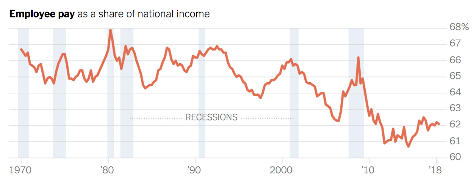
That does show a significant downtrend in the percentage of national income going to American labor. But what if we zoomed out? Here is how the chart looks with all the quarterly data provided by BEA, which start in 1947:
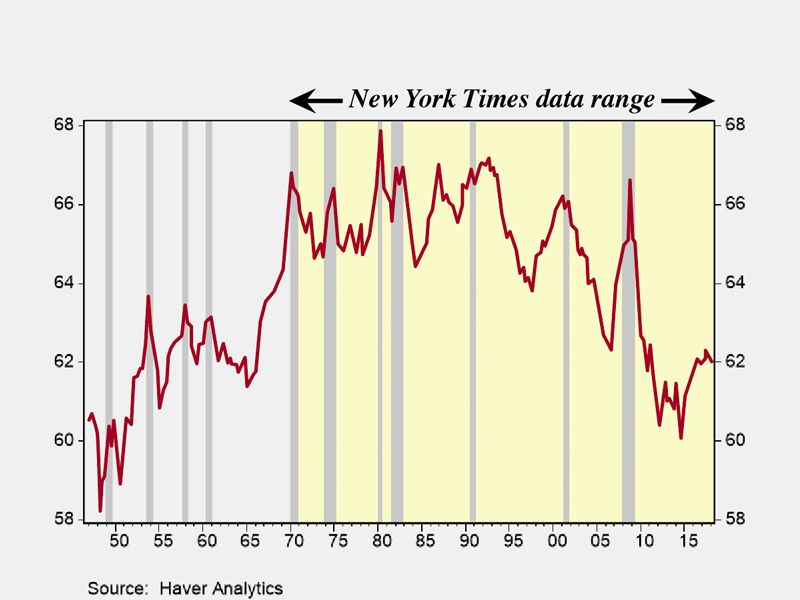
Notice that at the current 62 percent, labor's share of national income is generally equal to or higher than the years from 1947 through 1965, except during the aberrant periods of recession, when the ratio spikes because the denominator tends to fall faster than the numerator. Note also an even bigger spike during the Great Recession of 2008–09. Had our newspaper of record published the full version of this chart, Times reporter Cohen might have felt compelled to ask why labor's share is reverting back to levels following World War II—a period that progressives generally consider the glory decades of the American economy, when unions and factory work still accounted for a substantial share of employment and when cheap foreign labor was barely a factor.
Tackling that mystery would be a waste of time, though, because there are further distortions and omissions. Here's a more accurate look at labor's share of private sector output, in which the data is expressed annually instead of quarterly (at the suggestion of Robert Parker), in order to smooth out intra-year volatility. The final data point is for the first quarter of 2018, the most recent available period:
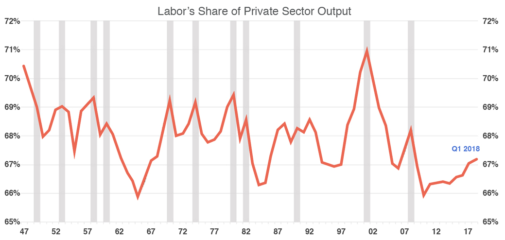
The time from 1947 to 1965 is now higher compared to later decades, with the entire historical range pretty well captured from 1947's high of 70.4 percent to 1965's low of 65.9 percent. Labor's current share, at 67.1 percent, is on the low side of that range, but it is equal to or greater than the years from 1994 to 1997. At the current level, the recent trend looks cyclical, as labor's share slowly climbs back from the 2010 low of 65.9 percent hit in the wake of the Great Recession's 10 percent unemployment rate in late 2009.
The false alarm about labor's plummeting share can be avoided by adjusting for components in the data that have skewed the trend. Failing to make those adjustments would be like concluding that a country has a soaring mortality rate when the median age of its population has doubled from 30 to 60.
Among the flaws in the Times' chart, there is the use of national income in the denominator, which introduces two distortions in the trend. First, it includes the government, which should be excluded, since this story concerns the capitalist private sector. (Recall the words in the Times headline: "Paychecks Lag as Profits Soar.") Second, by starting with national rather than domestic income, it includes the distorting effects of inflows and outflows from foreign countries. The BEA shifted three decades ago to reporting gross domestic product rather than gross national product, making the change to avoid that very problem. In the numerator, the Times errs by including compensation of government workers, and by excluding a significant part of private compensation that comes from the self-employed.
The denominator of our ratio begins with what the BEA calls "net domestic product" and "net domestic income," and then takes out the portion attributed to all levels of government, in order to isolate private sector net domestic product and private sector net domestic income.
By looking at net rather than gross domestic product and net rather than gross domestic income, we avoid the distortion that mars the widely cited data on labor's share released by the Bureau of Labor Statistics (BLS). The difference between gross and net is equal to the "consumption of fixed capital," or depreciation: the BEA's measure of "the decline in the value of the stock of fixed assets due to physical deterioration, normal obsolescence, and accidental damage."
Capital consumption has been taking a much larger bite than it used to because business has been investing far more than it once did in equipment and software rather than in structures (factories, offices, stores); and equipment and software depreciate much faster than structures. Since capitalists must keep replenishing their capital just to maintain the same level of output, net rather than gross measures belong in the denominator. Instead, the BLS uses gross measures, which helps create the illusion of a downtrend in labor's share.
Finally, our denominator takes an average for each year of private sector net domestic income and net domestic product, since each is using different sources to measure the same concept. This follows the example of the BEA, which takes a simple average of gross domestic income and gross domestic product,
The numerator of the ratio starts with total compensation—wages, salaries, and benefits—and (unlike the Times) takes out the compensation of government employees. It also includes a key component that tends to boost the 1950s and '60s, along with the present period: income of the millions of self-employed, recorded as "proprietor's income" by the BEA. The Times omitted that, but the BLS adds it to the numerator. Until 2001, the bureau had assumed that 85 percent of proprietor's income had gone to labor compensation (and the rest to proprietor's profits), but since then it cut this to less than half, for reasons that seem dubious. Instead, this calculation assumes a consistent 80 percent from 1947 to the present.
Of course, this exercise does not address widening inequality of pay. Our numerator of total private sector compensation commingles the high-paid labor of lawyers with that of fast-food workers. But when it comes to the issue at hand, skeptics are invited to scrutinize every line from the BEA tables used to produce this chart.
If unbiased data from the Bureau of Economic Analysis cannot validate a clear downtrend in labor's share, how valid can that downtrend be?


