Is the T in Donald Trump's New Campaign Logo Schlonging the P in Pence?
The GOP candidate's new graphic looks an awful lot like a penis.
More than a few people have already noticed that Donald Trump's new campaign logo, the first to reflect his choice of Mike Pence as his vice presidential running mate, looks more than a little bit sexually suggestive:

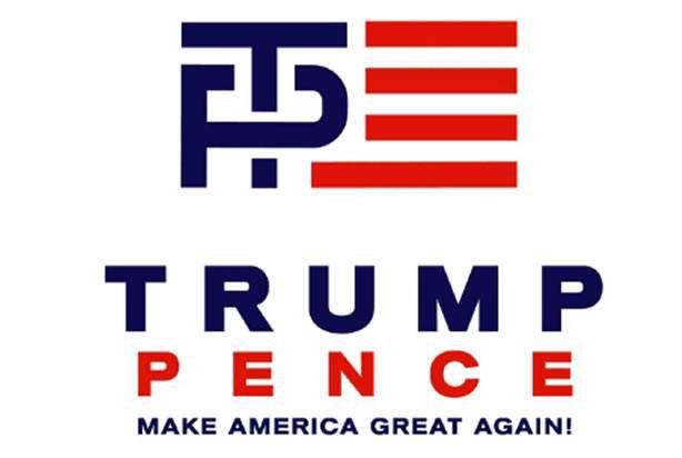
Specifically, the charge is that the T looks kind of like a penis—and that it appears, as Trump might say, to be shlonging the P in Pence, at least symbolically.
At Slate J. Bryan Lowder offers one possible interpretation, writing that the logo "very accurately conveys the attributes Trump wants associated with his political and personal brand—namely, that he has a penis and he uses it to screw people." I'm no graphic art critic, but the logo does seem to suggest that Trump is dominating Pence, a vice presidential pick that Trump was reportedly scrambling to reconsider as late as midnight last night.
Is that symbolism intentional or inadvertent? There's no way to say, and the cheap, amateurish quality of the design suggests that it may just have been drawn up quickly, with little thought as to the implications. But it certainly wouldn't be the first time that Trump has alluded to his manhood while on the campaign trail: In a Republican primary debate earlier this year, Trump responded to those who have described his (small) hands as small by saying "He referred to my hands, if they're small, something else must be small. I guarantee you there's no problem. I guarantee it."
I'm not sure there's too much in the way of penetrating insights to be gleaned from Trump's choice of logo. But it does strike me that the incident is typical of Trump's campaign so far. At worst it can be viewed bizarre, vulgar, and wildly inappropriate coming from a presidential candidate. At best it shows the candidate and the campaign to be inept and dysfunctional, reliant on shoddy workmanship, unable to exercise basic political judgment, and generally unable to competently execute the most basic elements of a modern political campaign. The logo is further proof, not that we needed any, that when it comes to running for president, neither Trump nor anyone he works with knows dick about dick.
Editor's Note: As of February 29, 2024, commenting privileges on reason.com posts are limited to Reason Plus subscribers. Past commenters are grandfathered in for a temporary period. Subscribe here to preserve your ability to comment. Your Reason Plus subscription also gives you an ad-free version of reason.com, along with full access to the digital edition and archives of Reason magazine. We request that comments be civil and on-topic. We do not moderate or assume any responsibility for comments, which are owned by the readers who post them. Comments do not represent the views of reason.com or Reason Foundation. We reserve the right to delete any comment and ban commenters for any reason at any time. Comments may only be edited within 5 minutes of posting. Report abuses.
Please
to post comments
Trumpenetration!
TP for my bunghole? *groans*
Cornholio! Is that you? After all these years? How are the kids?
Is it really worse than a logo that looks like a Hospital Ahead road sign? With an arrow pointing to the Right (gasp) no less? Is that some subtle signal that the way forward is not to lean left? Or is it just some dumbass logo that nobody really thought about or they thought about way too hard?
I thought it was clearly a plane going through the towers.
If it's good enough for FedEx, it's good enough for Shrill!
Now I'm convinced that Trump works for Clinton as a spoiler.
Amen!
I think Soros has bought off all of Hill's 'challengers'...
And if you focus on the negative space, you can clearly see a Muslim Hispanic being tossed over a wall by someone with tiny hands.
+1 Diego Mustapha Gozales Al Chihuahua
That's the dingo who stole my baby!
Did the P provide affirmative consent??
If you see a dick in that, you can see one absolutely anywhere.
Indeed. Reed Richards can't stretch this far.
Come on Peter
Aren't you missing a comma?
Nope
These euphemisms...
Abstract, euphemism, etc., amirite?
TDS is a hell of a thing.
Alternative theory: Trump utilizes the same strategy he always has. Put out something so subtly ambiguous, allowing himself plausible deniability while overthinking pundits like yourself carry the water by reporting on it and blowing things out of proportion, generating free press that brings more attention to Trump.
It also brings sympathy to Trump by reinforcing the untrustworthy, pants-shitting media trope.
Close enough?
I've wondered about that. He often seems to be subtly trolling the media. A little yank on their chains, and watch them go berserk..
But this is just dumb. As dumb as the whole star business.
"But it does strike me that the incident is typical of Trump's campaign so far."
A desperate media?
Even by cosmo standards, Reason is embarrassing.
and yet, here you are.
What it seems like to me is a bunch of folks straining to find anything they can to blast Trump - even things that aren't actually there.
There are plenty of legitimate things to blast Trump about without dreaming up nonsense like this.
And of course they are hypocritically NOT straining to do the same to Hillary.
Some people are desperate. They've been slamming Trump over and over with all the legitimate reasons to reject his bullshit - and he produces more every day - but its not fazing him at all.
Any other candidate who faced this sort of concentrated attack (even if it was illegitimate) would have been sunk almost immediately. Rand didn't survive more than a few weeks of the media pointing an laughing at his 'isolationist' (read: not inclined to bomb the shit out of every BSP that looks at us funny) stance.
The GOP power structure itself is going nuts - despite all their protestations no one is taking the 'very serious' people seriously. Maybe because we all know that when push comes to shove, they're going to get behind Trump and help push him forward because to do anything else would be to hand the presidency to the Democrats or *worse*, a 3rd party.
This logo is stupid. Mitt Romney's weird, tri-color, might be three doves flying together to form an "R" was much stupider than this.
They're all stupid. This isn't any worse than Jeb! or Marco Rubio's dumb fucking lower-48 dotting the i.
RAND's is boss.
link? I don't remember it.
'm not sure there's too much in the way of penetrating insights to be gleaned from Trump's choice of logo.
Uh huh. You couldn't resist, could you?
By the way, is there any way they could make the logo darker, so it looks like black and red? You know, for reasons.
The "T" is definitely schlonging the "P". But it looks more like a "T" than anything else you're seeing...
his name is peter lol
Regardless of Freud, the logo is ugly as hell. It looks like something that should be imprinted upon a bar of soap. The person who designed the logo should be frog-marched naked to the town commons and placed in a pillory for no less than a week.
*hands HM a basket of filth and rotting veggies*
FIRE AWAY!
Or maybe they could be hired as a designer for Unilever.
Face it, Suderman - your megafauna political party has four legs in the tar pit.
Why don't you wade in there and pull them out?
The biggest design problem with it is that the two bottom red lines should run all the way to the left to truly mimic the flag, as is its obvious intent.
Or maybe just one, to symbolize the Great Wall of Donald
I see what you did there.
Someone is amazingly unfamiliar with penises.
You guys are just fucking reaching now.
Actually, the "P" is the one generating all the power.
Did somebody say The Power?
Ah, I was expecting "Love Power" by Lorenzo St Dubois.
You've got the wrong Love Power.
Then I don't wanna be right.
So . . . Pence is a power bottom?
Now, Dennis, I've heard speed has something to do with it.
It looks like a "T" with a bike lock on it.
This "definitely schlonging" stuff says more about the "journalists" than the actual logo.
Yes. Very Freudian.
You had to dedicate an entire blog post to this?
Suderman's Trump Derangement Syndrome is getting out of control.
I looks exactly like my penis, but then I was the victim of an unfortunate lexicography accident in my 20s.
My penis looks like a "J".
Sorry to hear about your peyronie disease.
Uh, something about t.p. wiping something away or out?
This will be more likely. Plenty of TP jokes.
And this graphic is a Terrible Penis. I've seen four year olds draw better penises
Whoa!
Confirmation bias.
Similarly, others have "discovered" that it is an Aryan Nation symbol.
To me, it just looked like some college logo.
Much like a star with text in it looked just like a million other stars with text in it that you would see in advertising.
But I don't have Trump Derangement Syndrome, so I don't hysterically project insanity onto everything Trump does.
The NYT isn't going to hire you no matter what, Suderman.
Maybe Reason could send Suderman and some AA prospects interns over to Bloomberg in exchange for Megan
Addition by subtraction.
The cardinal--named after the crimson hue that is in turn named after the infamous papist henchman--sits atop a shillelagh, thus indicating the presumptive dominance of the Catholic church over the Protestant Irish minority. Which is just typical of the papist scum.
/Suderman
And the baseball bat looks like a penis.
To be fair, it's likely that Suderman's confusion stems from the fact that he's never seen a penis.
He's seen a penis before. Hell, he even had one at one point. Unfortunately, McArdle removed the penis and locked it in her lingerie drawer. He hasn't seen it for six years.
What are you fucking kidding me? It's an American flag logo with their initials. It's the least offensive thing the man has done in his entire career, even before politics.
A stretch like this is usually reserved for an All-Star first baseman finishing a hasty double play.
Good one Swiss. Have a schnapps.
Are you blind? It's like they're not even trying to hide the fact that it looks like a swastika made out of white male penises.
"Perverted? Me? *You're* the one with all the dirty pictures!"
My Dad's favorite joke.
The T would look less schlongy, and the P less like an F with a painful erection, if the over-under were the other way 'round.
"Oooooh! Now I see it!"
- Nobody
My, the folks at Reason find any excuse to write a Trump article, don't they?
No shit, it's really juvenile on the order of 7th grade pimpled lad juvenile.
Trump's a gigantic douche and cankles is Alien level horrifying and this is the best they can come up with. Really IMPOTANT shit.
Wow. I thought it was just the feminists who were obsessed with seeing everything as a phallic symbol.
OMG I can't believe everyone is missing the real story here. The negative space around the T and P is female cleavage. It's obviously another misogynist dog whistle, and also a racist one) designed to appeal to the racist alt-right and other 'real' males.
I don't see it.
...
...
Wait, did Suderman just write entire article about how a capital T looks like a penis? Jesus. It's like Trump's juvenile behaviour makes everyone think it's open season.
Imagine if they catch him wearing crocs or velcro shoes.
As though this is the issue with him.
When i think "Peter", do you know what comes to mind?
Did you notice the subtle 'H'? (Anyone find the '666'?)
My work likes to draw dicks around the place. Even the quick scribble ones are clearly penis drawings.
I write Craig, because that at least works.
I can't see it here. Really. What am I missing?
I don't see the penis.
Someone show me the penis!
Wait nononononononono
"come on in, Randy. We'll figure that out."
Looks to me, like the P is schlongin the T. There's the makings a rap tune here...
Not really seeing it. The T doesn't look all that phallic. What I do see, though, Is TP, what is apropos given that Trump & Pence is a shit ticket.
TP to clean the asshole that is Washington?
Click 'batin'!
It's a tough design challenge, because if you simply put the initials in sequence, you get "TP." Even this design doesn't entirely remove that association.
If that logo has the T schlonging the P, then it also has the P circumcising (brising?) the T.
If you hold it upside down, it looks like a man with a shield running really fast.
turn the image counter-clockwise, and it looks like a smiling man sporting a high top fade.
"Does the logo look like a penis..." Seriously? Are you guys hurting for money so you're just posting click bait? Did Gawker buy Reason?
Pathetic.
Has Megan seen this?
Fuck off, suderman. Seriously, just fuck yourself. A "T" looks like a penis? Fuck yourself. Between you, shika and "the joooos" richman, I don't know who the bigger asshole is.
Are you guys trying to make me vote for Trump simply out of spite? This is one of the dumbest fucking things I've read in my life. If a T makes you instantly think "penis" then I think it's time you had a talk with McArdle to let her know that your marriage is a sham.
Man, the Trumpalo tardwagon sure isn't powered by humor.
Not a Trumpalo, champ, wouldn't vote for him if you held a gun to my head. Just tired of this Buzzfeed quality idiocy when there are innumerable substantive attacks to make.
"If a T makes you instantly think "penis" then ..."
There's no 'T' in reason.
Just sayin'
I'm sorry, I know that this has been asked a million times before. But has anyone ever came up with an answer:
Why does Suderman write for Reason?
Does he actually think of himself as a libertarian? Does anyone else actually think of himself as a libertarian?
This is such a ridiculous stretch. Does reason really just pay this guy to troll the readers? (might be a good strategy, I keep reading hist stuff)...
This is libertarianism's downside. Principle without a sense of scale.
Trump is just being fiscally responsible by getting his logos and graphics on Fiverr. It costs like three times more for the unlimited revisions extra gig.
Ok, I see where this is going....
First, "everybody" claims that the Trump-Pence logo is a penis.
Second, the Title IX Warriers claim that the Trump-Pence "penis" logo is "triggering" for rape survivors and demand that it be banned from college campuses.
Third, all Trump supporters are expelled for destroying the colleges' "safe space" by harboring the "penis" logo.
Not to mention the damage done the psyches of aboriginals with the callous cheap shot at teepees.
Goddamnit Suderman, you nailed it.
All these distractions; a military coup in Turkey, a jihadist massacre in France where they are on a knife edge between civil war and peace, riots in the streets of America and you cut right to the heart of important matters.
Bravo Pete. Bravo. You thu man.
*someone please fire this stupid motherfucker
LOL!
REASON publishes yet another unREASONable essay that is truly a case of seeing what one wants to see. One could just as easily see a P hugging daddy T, though that causes a square block to fall off. But it would be more REASONable to assume that a guy who's dealt with builders & architects is going for an image of stability, a sort of blueprint-like image of integral structure and design, successful or not. As an artist, I'd say it's not bad at conveying strength & stability.
Stay off the porn, buddy.
More than a few people have already noticed that the "d" in Suderman's last name looks like an erect penis having lustful designs on the "u" that precedes it, undoubtedly without having first obtained the affirmative consent of the "u."
At worst Suderman can be viewed bizarre, vulgar, and wildly inappropriate. At best it shows the Suderman family to be inept and dysfunctional, reliant on shoddy workmanship, and unable to exercise basic judgment in the selection of a surname.
(Hey, I think I have the hang of it...)
You can't spell "impotent" without a P or a T, so they've got that going for them.
Sure, just like the Hillary logo is clearly a very well endowed man with a big head penetrating a woman while standing up! Hillary likes it that way! /Sarc
Now, can you please stop the pseudo Freudian bullshit and try to talk about issues?
Definitely - if the UK can have Lisa Simpson blowing a dude as their Olympic symbol then Trump can have a mildly shitty one.
Some of those are truly egregious.
My favorite is the Brazilian Institute of Oriental Studies, which actually took a little studying to "get" the actual read.
The "Young Alarm" is the best for combining making the name of the company disturbing in its own right.
They missed this one.
That last one. "There are no chicks with dicks, only dudes with tits!"
Sadly, yes.
You know who else ...
Noyce!