The Volokh Conspiracy
Mostly law professors | Sometimes contrarian | Often libertarian | Always independent
SCOTUS Redesigns The Docket Page
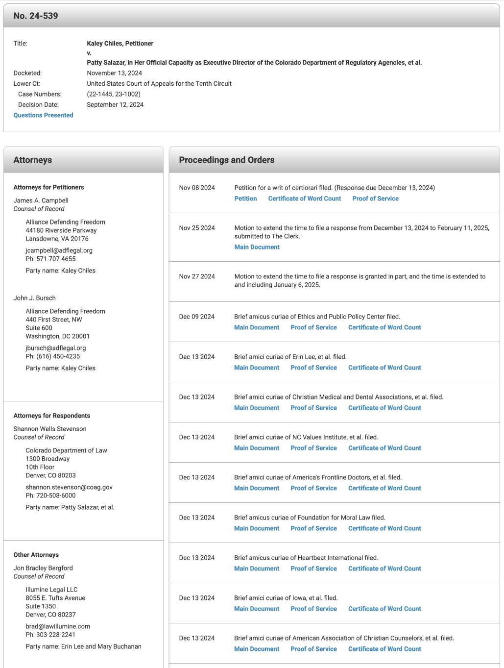
SupremeCourt.gov got a redesign recently. The docket page previously looked like this. With the old design, all of the counsel were listed at the bottom of the page. There is a lot of wasted white space.
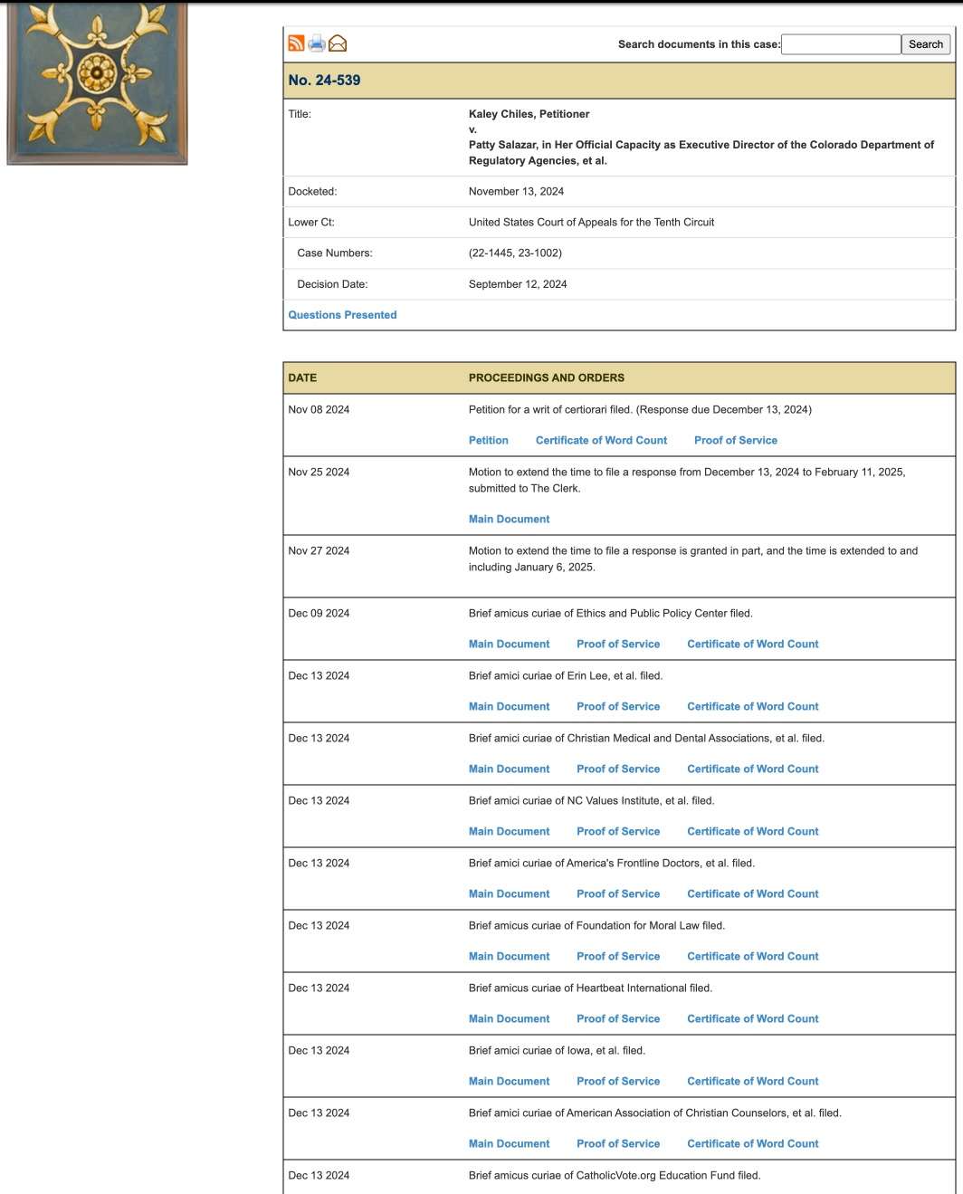
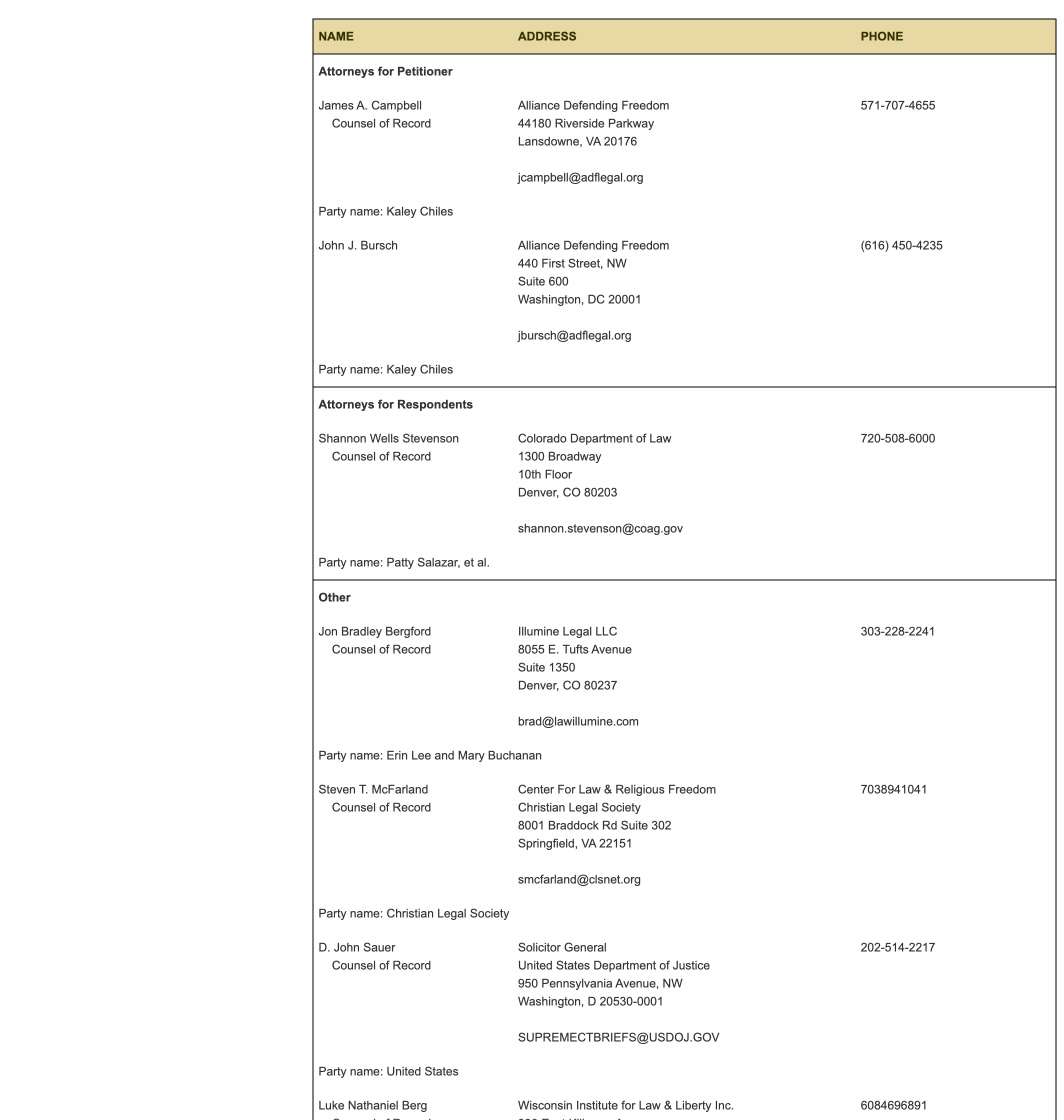
The new design has a different color scheme. The brown color is now a silver color. And the sharp edges are now rounded. The biggest change is that counsel are listed on the left side column. The new design is far more elegant, and has far less wasted space.
Editor's Note: We invite comments and request that they be civil and on-topic. We do not moderate or assume any responsibility for comments, which are owned by the readers who post them. Comments do not represent the views of Reason.com or Reason Foundation. We reserve the right to delete any comment for any reason at any time. Comments may only be edited within 5 minutes of posting. Report abuses.
Please
to post comments
Here me out, even though it may sound crazy...
Perhaps the next term's calendars were not "late" because of any unknown, secret turmoil inside the Court, which some are itching to discover. Maybe they were finalized on the usual timeline, but the tech people delayed its posting because they were finalizing and testing this new web design.
Or maybe the chief should just resign over this latest failure.