Global Temperature Trend Update: May 2011
Every month University of Alabama in Huntsville climatologists John Christy and Roy Spencer report the latest global temperature trends from satellite data. Below are the newest data updated through May, 2011.
Pacific cooling fades and temperatures rise
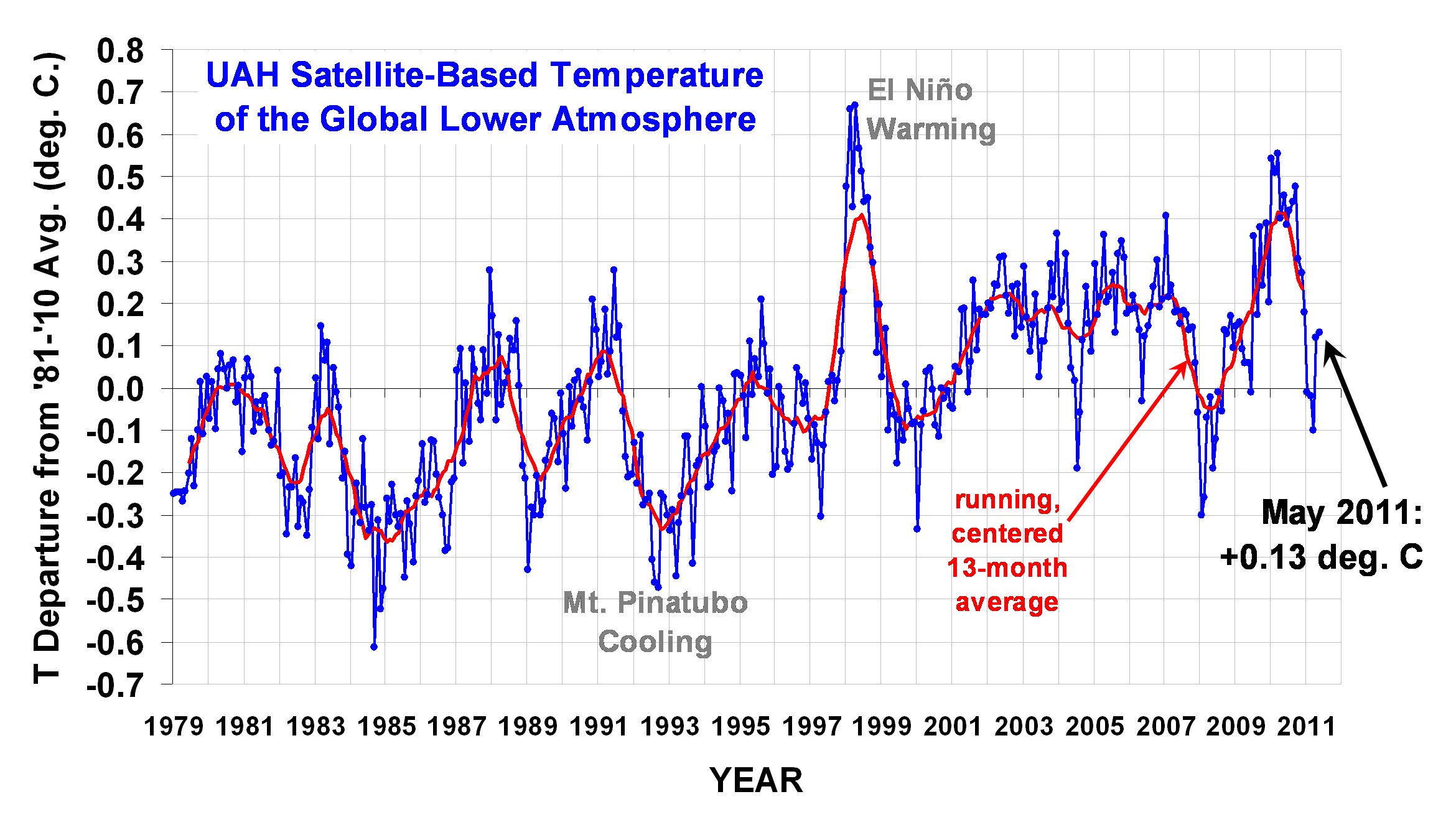
Global Temperature Report: May 2011
Global climate trend since Nov. 16, 1978: +0.14 C per decade
May temperatures (preliminary)
Global composite temp.: +0.13 C (about 0.23 degrees Fahrenheit) above 30-year average for May.
Northern Hemisphere: +0.14 C (about 0.25 degrees Fahrenheit) above 30-year average for May.
Southern Hemisphere: +0.12 C (about 0.22 degrees Fahrenheit) above 30-year average for May.
Tropics: -0.04 C (about 0.07 degrees Fahrenheit) below 30-year average for May.
April temperatures (revised):
Global Composite: +0.12 C above 30-year average
Northern Hemisphere: +0.20 C above 30-year average
Southern Hemisphere: +0.04 C above 30-year average
Tropics: -0.23 C below 30-year average
(All temperature anomalies are based on a 30-year average (1981-2010) for the month reported.)
Go here to see the global temperature data by month.
Editor's Note: As of February 29, 2024, commenting privileges on reason.com posts are limited to Reason Plus subscribers. Past commenters are grandfathered in for a temporary period. Subscribe here to preserve your ability to comment. Your Reason Plus subscription also gives you an ad-free version of reason.com, along with full access to the digital edition and archives of Reason magazine. We request that comments be civil and on-topic. We do not moderate or assume any responsibility for comments, which are owned by the readers who post them. Comments do not represent the views of reason.com or Reason Foundation. We reserve the right to delete any comment and ban commenters for any reason at any time. Comments may only be edited within 5 minutes of posting. Report abuses.
Please
to post comments
Dead horse is beaten. Again.
But dude, it's getting hotter! By the day, even! It's like 20 degrees hotter than it was a month ago!
Well, not here. It's been 90 since April.
They must ask themselves why they hate the dead horses.
Like predicting the S&P 500 index 1,000 years from now using second-by-second trend analysis of the S&P 500 now.
It's going to be a real scorcher in the east tomorrow: upper nineties and possibly even hitting 100 in some areas.
For whatever reason, the unusually cool weather is still persisting in the west though. Now that's an anomaly.
It's a hundred fucking degrees here in Austin. I'm heading to California tomorrow to cool off.
Hold off a few days, it's rising to 60 today.
The lingering effects of a powerful La Nina are keeping western temperatures unseasonably cool. If we have an El Nino this summer it'll get hot enough.
It snowed a couple of weeks ago at my home in the mountains of New Mexico.
... "La Nina" Hobbit
weren't the 70s one of the coolest decades in modern history?
and wouldnt that make any trend that starts from that time period unreliable?
We look for our lost watches under the street lamp, because there is no light in the alley where we dropped the watches.
Homer: Well, there's not a bear in sight. The Bear Patrol is sure doing its job.
Lisa: That's specious reasoning, Dad.
Homer: Thank you, sweetie.
Lisa: Dad, what if I were to tell you that this rock keeps away tigers.
Homer: Uh-huh, and how does it work?
Lisa: It doesn't work. It's just a stupid rock.
Homer: I see.
Lisa: But you don't see any tigers around, do you?
Homer: Lisa, I'd like to buy your rock.
"weren't the 70s one of the coolest decades in modern history?"
The 70s were lame with all the sideburns and leisure suits.
+1
If your funding depends upon your giving evidence that supports the argument that we need new taxes, subsidies and regulations in the name of saving the planet, then of course you would want to start from the lowest point you could find and use the highest data points you could find from then on.
This is the satellite temperature record, so it can't have data before the first temperature satellite was launched in December 1979.
The surface temperature record is currently a pile of garbage as far as verifiability goes, so we actually don't know what things were like before then, on a global basis. When BEST gets released, reviewed, analyzed, and challenged, then we'll be able to actually say something about temperatures before 1980.
Simply claiming surface data is unreliable doesn't make it so.
How many temperature readings did we take in the middle of the oceans in the past century?
As we are continually reminded, climate is not weather. Measuring the temperature at a finite number of sites is trying to extrapolate local conditions and variations into a global climate model.
Ron, do you know of a good site with a comprehensive and up-to-date chart of sunspot activity? Maybe something that has at least a century of data and includes 2011? My understanding is that we should have moved back to a maximum by now, but we're languishing with lower activity still.
Predictions are now that 2013-14 will be the peak, but I don't see how a steady eleven year cycle could suddenly stretch out or shift like that. Some are concerned the lowered activity could presage a mini ice age.
http://www.spaceweather.com/
Thanks, but I've already checked that site out, and it doesn't have data beyond Jan 1, 2009. The trend it shows lines up with what I'm talking about. 2008 had really really low activity, when it should've been picking up again.
Have you checked out Anthony Watts' sight? He seems to get up-to-date stuff from somewhere (http://wattsupwiththat.com/reference-pages/solar/)
Ah, thanks. Way down the page, about 3/4 of the way down, is a chart showing just the last cycle and a half or so, but you can see that sunspot activity is pretty weak. I don't see these predictions of a peak in 2013-14 as making much sense. It's quite possible, in my mind, that we're peaking right now, and will see another ebb soon. But, I'm not an expert, so who knows.
On side note, checking that site out was worth it. Apparently there was epic solar flare yesterday. Plasma balls the size of Earth splashing back down on the Sun-scale event. Maybe auroras tonight. Sweet.
Allright Bailey, don't know what your problem is but there is a time problem here. You see the chart starts in 1979, that is 32 years ago, a mere millisecond in climate history, understand that?
What is the mean temperature supposed to be? How do you figure that out?
How do you know we are not still coming out of the "little ice age"? etc.etc. etc....
don't you see, 1979 was the perfect year. The Steelers won the Superbowl, Jimmy Carter was President, and Disco was king.
Therefore it was the perfect temperature and any deviation from that is bad.
Terry & pantsfan; this data series starts in 1979 because that is when the satellites that measure global temperature started operating.
Oh I see, because this data source happens to support the point they're trying to make they use it over all the other climate records that don't agree with them. Isn't that like the definition of cherry picking or something?
Engineer: what are you talking about? I cite it because it covers virtually the entire planet including the oceans.
Ron the point is that the time measured is far to short to make any conclusions.
So you shouldn't even bring it up.
When you do you imply it has credibility when it doesn't.
The graph Ron provided (made by Roy Spencer) implies that global warming due to increases in CO2 is non-existent and the slight warming from 1980 to present is not extraordinary but resembles a random walk.
It should be noted that Roy Spencer is a skeptic.
No, Roy Spencer is something far to rare in "climate" discussions. An actual goddamned scientist.
The satellite record closely matches the surface record.
Also when tinfoil hats came into popularity.
Coincidence?
Yes... coincidence, that's the ticket.
Summer is finally here in Michigan. I've been running my furnace through the entire month of May when I would normally be running my sprinklers.
Global temps have so much meaning I can't stand it.
Same here in Minneapois.
It was 103 yesterday, but by tomorrow the high only will be 68.
It was 103 yesterday,
Global Warming!!!!
but by tomorrow the high only will be 68.
Weather is not climate.
Bravo, RC. Well done.
... Hobbit
Here in Maine my furnace fired up in June.
JUNE for fuck's sake!
If the planet is warming why am I burning heating oil in June?!?
because you're too tophat/monocle-ey to just throw on an extra comforter.
If the planet is warming why am I burning heating oil in June?!?
Cuz you are an old fart who gets chilled easily.
Where in Maine? I was born in Aroostock County but apparently everyone from Maine lives on the coast.
... "Presque Isle" Hobbit
L/A area
Weather isn't climate.
Please, be a sweetie, and don't ask me what that means.
still higher highs, and higher lows, the trend is still up.
Hey Bailey,
Just wanted to say thanks for blogging these interesting monthly updates with real observational data on temperature.
Politics aside, climate is fascinating subject and I always am interested in real data like this (vs. hypotheticals and video games) regarding it.
I've noticed that when the weather guy gives his predictions, if it's going to be cold it is "colder than average" and if it's going to be warm it's "warmer than normal".
It's never "warmer than average", it's "warmer than normal".
And it's never "colder than normal", it's "colder than average".
Hmmmmmmmmmm.
Looking at that chart, I would say that temps were basically range-bound before 1998, then we had a blow-off El Nino, and they have basically been range-bound in a slightly higher range since.
Except for the most recent El Nino, which is oddly not identified as such.
I wonder which climatologist published a paper predicting range bound temperatures, punctuated by El Ninos.
Except for the most recent El Nino, which is oddly not identified as such.
Ron does not identify it but that graph originates from Roy Spencer who on his web site notes the recent el nino in the text he provides with the graphs.
Here's exactly the chart I was looking for:
http://solarscience.msfc.nasa.gov/images/bfly.gif
How can you look at that and not realize that sunspot activity obviously correlates with temperate changes? Cycles 17-23 were all obviously bigger/stronger than cycles 12-16, and cycle 24 is looking weak.
yes, and did you notice that the dust bowl is at the same part of the sunspot cycle as 2011-2013?
You're suggesting that weaker solar activity correlates with higher temperatures? Because that's the only trend that could be drawn from the data. The 80's were warmer than the 70's, the 90's were warmer than the 80's, the 2000's were warmer than the 90's and 2010 was the warmest year on record. This entire period is characterized by weakening solar activity.
You're suggesting that weaker solar activity correlates with higher temperatures? Because that's the only trend that could be drawn from the data.
I would say the term 'weaker' isn't an apt descriptor there. When solar activity is high (not 'stronger') there are greater amounts of sunspots and their resulting magnetic effects with flares and the like.
Sunspots indicate a lower temperature, after all that's why they're 'spots.' More sunspots = lower average temperature for the solar disc and I would assume lower resulting thermal output as well.
So yeah, in that context, 'weaker' solar activity suggests higher thermal output from a Sun that on average would be a bit warmer.
I'm not particularly advocating or defending the connection about sunspots and local earth temps either. Just can't help but note you seem to have equated 'weaker' solar activity into somehow meaning a 'weaker' Sun also, which is not accurate perception at all.
ITT everyone confirms their biases.
thanks
I have the pleasure to brief you on our Data Visualization software
"Trend Compass".
TC is a new concept in viewing statistics and trends in an animated
way by displaying in one chart 5 axis (X, Y, Time, Bubble size &
Bubble color) instead of just the traditional X and Y axis. Discover
trends hidden in spreadsheets. It could be used in analysis,
research, presentation etc. In different business sectors, to name a
few we have Deutsche Bank, NBC Universal, RIM, Vanguard
Institutional Investor, Ipsos, Princeton University as our clients.
NBC presentation on TED using Trend Compass exported Videos. Now on
CNN Money / Fortune (Dec 21st,2010):
http://tech.fortune.cnn.com/20.....d-emotion/
The following link is for our new Geographical Trend Compass
(Earthquake in Japan - Mag vs Depth vs Time):
http://www.epicsyst.com/test/v2/japan-earthquake
Link on OPEC oil indicators:
epicsyst.com/test/v2/libya-oil/
Link on UK Master Card vs Visa performance :
epicsyst.com/test/v2/mastercard_vs_visa/
All the best.
Amr Salah
Trend Compass Team
Epic Systems
epicsyst.com