Every month University of Alabama in Huntsville climatologists John Christy and Roy Spencer report the latest global temperature trends from satellite data. Below are the newest data updated through November, 2010.
Third warmest November leaves 2010 behind '98
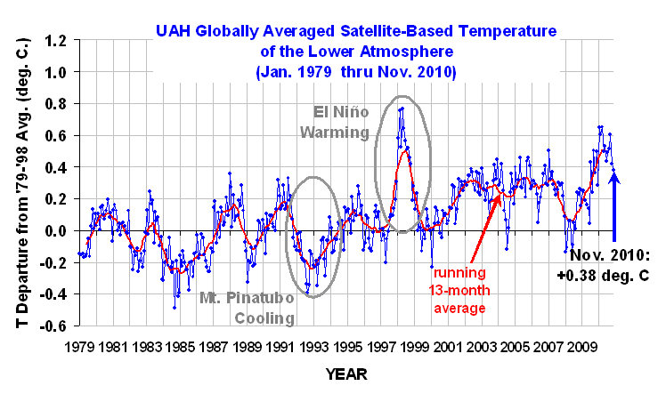
Global climate trend since Nov. 16, 1978: +0.14 C per decade
November temperatures (preliminary)
Global composite temp.: +0.38 C (about 0.69 degrees Fahrenheit) above 20-year average for November.
Northern Hemisphere: +0.51 C (about 0.92 degrees Fahrenheit) above 20-year average for November.
Southern Hemisphere: +0.25 C (about 0.45 degrees Fahrenheit) above 20-year average for November.
Tropics: -0.07 C (about 0.23 degrees Fahrenheit) below 20-year average for November. October temperatures (revised):
Global Composite: +0.43 C above 20-year average
Northern Hemisphere: +0.37 C above 20-year average
Southern Hemisphere: +0.48 C above 20-year average
Tropics: +0.16 C above 20-year average
(All temperature anomalies are based on a 20-year average (1979-1998) for the month reported.)
The satellite temperature data set is available here.
Notes on data released Dec. 6, 2010:
November 2010 came in as the third warmest November in the 32-year satellite temperature record, but still warmer than November 1998, according to Dr. John Christy, professor of atmospheric science and director of the Earth System Science Center at The University of Alabama in Huntsville. From January through November, that leaves 2010 only 0.012 C (0.022° F) cooler than 1998, which was the warmest year in the satellite record.
"The globe was cooling in late November, with daily anomalies around +0.1 C," said Christy. "It looks like 1998 might stay the warmest year in the record, but will most certainly be within 0.1 C -- an amount that isn't significant in terms of measurement precision. It would be a statistical tie."
2010 will be the 13th consecutive year with global average temperatures that were warmer than their seasonal baseline norms.
November temperatures in the tropics were more than 0.8 C (about 1.4 degrees Fahrenheit) cooler than the +0.79 C peak in February 2010.
Technical Note:
Beginning with the December 2010 Global Temperature Report, the baseline period used to determine seasonal norms will change. It has been the 20-year (1979 to 1998) period at the beginning of the satellite record. Starting next month the report will use a new 30-year (1981 to 2010) reference average to match the climatological period normally used with climate data by the U.N.'s World Meteorological Organization.
This will not affect the long-term trend, but will "reshuffle" the anomalies to reflect the new base period.
Start your day with Reason. Get a daily brief of the most important stories and trends every weekday morning when you subscribe to Reason Roundup.
Editor's Note: As of February 29, 2024, commenting privileges on reason.com
posts are limited to Reason Plus subscribers. Past commenters are grandfathered in for a temporary
period.
Subscribe
here to preserve your ability to comment. Your
Reason Plus subscription also gives you an ad-free version of reason.com, along with full access to the
digital
edition and archives of Reason magazine. We request that comments be civil and on-topic. We do
not moderate or assume any responsibility for comments, which are owned by the readers who post them. Comments
do not represent the views of reason.com or Reason Foundation. We reserve the right to delete any comment and
ban commenters for any reason at any time. Comments may only be edited within 5 minutes of posting. Report abuses.
How come they don't put out what is the plus and minus of their accuracy when they put out this information? They claim accuracy down to a hundredth of a degree, shouldn't they also tell the accuracy of their measurements?
Multiple measurements reduce error estimates. For example, you have two thermometers that are accurate to plus or minus two degrees. One indicates 10C and the other reads 12C, the filtered result is 11C plus or minus 1.4. The raw satellite data is not very accurate, but the reported results are made from thousands of data points.
If a large number of measurements come from one instrument, and there is systematic error or poor calibration, then all of the thousands of data points will be offset, despite the small error (standard deviation) bars.
There is a distinction between statistical and systematicuncertainties (and in my business model dependencies as well).
But in a time series taken from a single detector (as here), the trend (such as it is) is reliable unless there are uncorrected calibration drifts. This instrument is relatively well calibrated.
What you're looking at here is the most reliable single data set. It's big shortcoming is its short reach along the time axis: it's hard to say much conclusive about climate drifts with only 30 years of data.
Error bands would be nice, but you can get a rough idea of the statistical variability just by eyeballing the graph. The noisiness suggests a sigma (standard deviation of these monthly averages) around 0.1--0.15 degrees C.
Systematics are another matter, but the underlying technique appears to be pretty reliable.
Probably the most interesting analysis would be to make a linear fit across the whole data set and report the slope and error on it. That said, my eyeball figures this for a positive slope and at somewhere between 1 and 2 sigma: i.e. bet on rising temperatures but don't give long odds.
My problem with this data is that they're looking at monthly numbers (averaged over 13 months) to identufy trends for a pattern that has been going on for billions of years. This is equivent to looking at the Dow on a second-by-second basis for one hour and using the data to make universal predictions on the stock market.
Fun with charts. If you run the same set with '89-08' as the 20 year average, the '98 peak and '84 trough are the same distance from the 0 point and the early '80s look unbearably cold while the '00s look a slightly warm. (Offset is -0.12)
This is not a problem for me, but average of the whole set would be problematic because the implicit assumption is that all temperatures are within a normal distribution. It would defeat the whole AGW thesis. I was just having a little fun selecting my own arbitrary zero range, without regard to the question of whether 20 years is representative of an entire cycle, etc, etc.
This would be a perfect choice to make for the first time you present the figure. It is typical across many fields to present updated data sets on the same axis you used before. It makes for nice powerpoint: you pop up last years graph, then fade in the new data.
Only a few more weeks until we can finally begin the process of a real investigation into the charlatans and liars behind this whole global warming scam. It's long overdue, and I can't wait.
I don't care what the temperatures have been or are going to be on some NASA satellite; I don't live way up in Earth orbit. What temperature is it going to be here on the ground, and what's the government doing about it? I have shopping to do next week and I don't like driving in snowball fights.
Starting next month the report will use a new 30-year (1981 to 2010) reference average to match the climatological period normally used with climate data by the U.N.'s World Meteorological Organization.
For one month I will be happy. Will to be rolling 30 year after that?
I know you've opined before that the choice of the early period as the basis for calculating the anomaly is a effort to make it look like the the last decade is "hot" versus some standard of the "right" temperature, and you may or may not be right, but formally the choice of the baseline is arbitrary and neither adds not subtracts any information or value from the figure. Admittedly propaganda doesn't play by the rules of correct analysis, but the Huntsville group has never struck me as a propaganda machine.
Whatever investigative strength this data has is in the trend which won't change.
Let's get the word out in tropicalized Minnesota - they will surely appreciate that this last November was the hottest Nov ever.
But it's cold in my office! And it's snowing outside! And...other anecdotal things!
I, for one, welcome the warm future in Michigan, "Cancun of the Midwest".
How come they don't put out what is the plus and minus of their accuracy when they put out this information? They claim accuracy down to a hundredth of a degree, shouldn't they also tell the accuracy of their measurements?
Kalman Filter
http://en.wikipedia.org/wiki/Kalman_filter
Multiple measurements reduce error estimates. For example, you have two thermometers that are accurate to plus or minus two degrees. One indicates 10C and the other reads 12C, the filtered result is 11C plus or minus 1.4. The raw satellite data is not very accurate, but the reported results are made from thousands of data points.
That doesnt change the lack of reporting of this reduced error.
If a large number of measurements come from one instrument, and there is systematic error or poor calibration, then all of the thousands of data points will be offset, despite the small error (standard deviation) bars.
There is a distinction between statistical and systematicuncertainties (and in my business model dependencies as well).
But in a time series taken from a single detector (as here), the trend (such as it is) is reliable unless there are uncorrected calibration drifts. This instrument is relatively well calibrated.
What you're looking at here is the most reliable single data set. It's big shortcoming is its short reach along the time axis: it's hard to say much conclusive about climate drifts with only 30 years of data.
Error bands would be nice, but you can get a rough idea of the statistical variability just by eyeballing the graph. The noisiness suggests a sigma (standard deviation of these monthly averages) around 0.1--0.15 degrees C.
Systematics are another matter, but the underlying technique appears to be pretty reliable.
Probably the most interesting analysis would be to make a linear fit across the whole data set and report the slope and error on it. That said, my eyeball figures this for a positive slope and at somewhere between 1 and 2 sigma: i.e. bet on rising temperatures but don't give long odds.
And, today is unusually chilly.
Is it chilly in Paraguay? (It's in the 90s)
How about Rio or Sydney? (80s and 70s)
It's late spring in those places you know.
(It is a little chilly in Chile, though. 50s and 60s)
Ron:
The temperature dataset link is password protected. Any chance of posting a link to it that isn't?
Thanks
Nevermind. I just dropped all the reason stuff from the URL. Direct url is: here
My problem with this data is that they're looking at monthly numbers (averaged over 13 months) to identufy trends for a pattern that has been going on for billions of years. This is equivent to looking at the Dow on a second-by-second basis for one hour and using the data to make universal predictions on the stock market.
...on a second-by-second basis for a few minutes...
Ftfy
I'd like to see this chart superimposed over one detailing global carbon emissions over the same period.
I'd bet there's not a whole lot of correlation.
+1
This meant to go under "Hmmm."
Insert standard 0 point rant here.
Fun with charts. If you run the same set with '89-08' as the 20 year average, the '98 peak and '84 trough are the same distance from the 0 point and the early '80s look unbearably cold while the '00s look a slightly warm. (Offset is -0.12)
A rolling 20 year average as the zero point would be better, but I would prefer the zero point be the average of the entire data set.
This is not a problem for me, but average of the whole set would be problematic because the implicit assumption is that all temperatures are within a normal distribution. It would defeat the whole AGW thesis. I was just having a little fun selecting my own arbitrary zero range, without regard to the question of whether 20 years is representative of an entire cycle, etc, etc.
This would be a perfect choice to make for the first time you present the figure. It is typical across many fields to present updated data sets on the same axis you used before. It makes for nice powerpoint: you pop up last years graph, then fade in the new data.
No shit. Assuming that the data is "clean", it's a tiny bit warmer on average than 1980. So what?
The average temperature has always changed over time. This tells us nothing particularly meaningful.
Only a few more weeks until we can finally begin the process of a real investigation into the charlatans and liars behind this whole global warming scam. It's long overdue, and I can't wait.
Any day now the diehard localvores here in Montana will be able to add bananas to their menus.
That graph is worthless.
I don't care what the temperatures have been or are going to be on some NASA satellite; I don't live way up in Earth orbit. What temperature is it going to be here on the ground, and what's the government doing about it? I have shopping to do next week and I don't like driving in snowball fights.
At -15 deg wind chill last night, can't have GW too soon.
Hmmmm. Just what do they mean by "lower atmosphere"? 1km above sea level? 10km?
Starting next month the report will use a new 30-year (1981 to 2010) reference average to match the climatological period normally used with climate data by the U.N.'s World Meteorological Organization.
For one month I will be happy. Will to be rolling 30 year after that?
I know you've opined before that the choice of the early period as the basis for calculating the anomaly is a effort to make it look like the the last decade is "hot" versus some standard of the "right" temperature, and you may or may not be right, but formally the choice of the baseline is arbitrary and neither adds not subtracts any information or value from the figure. Admittedly propaganda doesn't play by the rules of correct analysis, but the Huntsville group has never struck me as a propaganda machine.
Whatever investigative strength this data has is in the trend which won't change.
It is funny reading how poeple think this graph hurts the skeptics case...when in fact it supports it.
AGW models and the IPCC claim a 3-6 degree increase over the next hundred years.
The last 30 years have seen only a .14 per decade degree increase. That is only 1.4 degrees over a hundred years.
This graph proves AGW theory wrong.
thanks