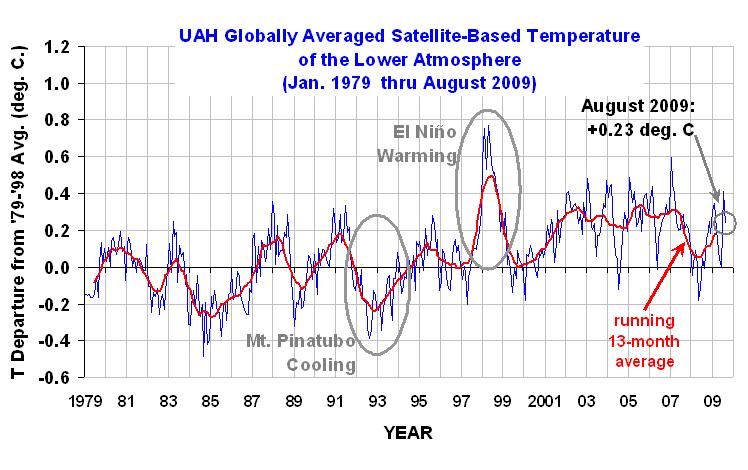
Global Temperature Trend Update—September, 2009
Every month University of Alabama at Huntsville climatologists John Christy and Roy Spencer report the latest global temperature trends from satellite data. Below are the newest data updated through August, 2009.
YR MON GLOBE NH SH TROPICS
2009 1 +0.304 +0.443 +0.165 -0.036
2009 2 +0.347 +0.678 +0.016 +0.05
2009 3 +0.206 +0.310 +0.103 -0.149
2009 4 +0.090 +0.124 +0.056 -0.014
2009 5 +0.045 +0.046 +0.044 -0.166
2009 6 +0.003 +0.031 -0.025 -0.003
2009 7 +0.412 +0.212 +0.610 +0.427
2009 8 +0.231 +0.284 +0.179 +0.455
Roy Spencer reports:
August 2009 saw a modest fall in the global average tropospheric temperature anomaly, from +0.41 deg. C in July to +0.23 deg. C in August. The tropical and Northern Hemispheric troposphere remain quite warm, but the Southern Hemisphere cooled by over 0.4 deg. C in the last month.
Editor's Note: As of February 29, 2024, commenting privileges on reason.com posts are limited to Reason Plus subscribers. Past commenters are grandfathered in for a temporary period. Subscribe here to preserve your ability to comment. Your Reason Plus subscription also gives you an ad-free version of reason.com, along with full access to the digital edition and archives of Reason magazine. We request that comments be civil and on-topic. We do not moderate or assume any responsibility for comments, which are owned by the readers who post them. Comments do not represent the views of reason.com or Reason Foundation. We reserve the right to delete any comment and ban commenters for any reason at any time. Comments may only be edited within 5 minutes of posting. Report abuses.
Please
to post comments
That chart reminds me of trading stocks.
OMG! CLIMATE CHANGE IS GONNA KILL US ALL!!!1!!!1!!1!111
Error bars, man! Error bars!
I can see not putting them in the graph you post too the blog: too confusing for the hoi polloi, but throw us a link of something, `K?
Wow, way to analyze the data wrong. A 30 year snapshot won’t show the overall warming trend. I thought this was well understood by now.
A 30 yr snapshot might not show a warming trend but in this case it really should since the start point was one of the coldest periods and the end point is supposed to be one of the highest. Plus the CO2 change from 1979 to 2009 has been very large. If CO2 is a driver of global heat shouldn’t we expect to see the warming??
The short answer is we don’t.
Oh look. Roy has stopped fitting a fourth degree polynomial to the data. I wonder why?
http://scienceblogs.com/illconsidered/2006/01/one-hundred-years-is-not-enough.php
http://scienceblogs.com/illconsidered/2008/07/how_to_talk_to_a_sceptic.php
Er, Tom.
Did you notice what is represented there?
It’s satellite data. Which means that you had to have satellites taking measurements to get a point for the time series.
Combining indicators to show a longer series brings in a host of other possible things to argue about.
Can someone show me a 20 year running average instead? Preferably on 50-100 years of data. That would show the real trend if there is any. Glancing at the data, I see what looks like about a .15-.20C rise in average temp over the last 30 years. That means the world will be around 1F warmer in the year 2100. Folks, we can’t wait any longer and run the risk of a Minnesota winter becomming tolerable.
Glancing at the data, I see what looks like about a .15-.20C rise in average temp over the last 30 years. That means the world will be around 1F warmer in the year 2100.
Run for the hills!
EscapedWestOfTHeBigMuddy, yeah sorry, I wasn’t very clear. I understand that this is satellite data and that the data itself wont go back far enough to show the overall warming trend. While typing my first post, I was mostly responding to TomCat1066’s post, though I didn’t make that clear and should have.
Regardless, though I do find any data interesting, what’s the point of posting this small satellite sample that can very easily be misinterpreted by climate change denialists because it really isn’t enough data to make an accurate judgment?
“Regardless, though I do find any data interesting, what’s the point of posting this small satellite sample that can very easily be misinterpreted by climate change denialists because it really isn’t enough data to make an accurate judgment?”
The satellite data is more accurate than the land based data because the land based data doesn’t correct sufficiently for the urban heat island effect and for the fact that there is less data coming from the former Soviet Union which previously influenced lower average temperature. The IPCC has chosen to cherry pick the data by using land based data because it shows a greater temperature increase over time than does the satellite data.
EscapedWestOfTHeBigMuddy, yeah sorry, I wasn’t very clear. I understand that this is satellite data and that the data itself wont go back far enough to show the overall warming trend. While typing my first post, I was mostly responding to TomCat1066’s post, though I didn’t make that clear and should have.
My post was pure sarcasm and nothing else. If you want to respond seriously, go right ahead. I’ll feel free to laugh at you repeatedly for it.
“Wow, way to analyze the data wrong. A 30 year snapshot won’t show the overall warming trend. I thought this was well understood by now.”
There has been a warming trend ever since the end of the Little Ice Age, long before man’s output of CO2. Within that overall warming trend, there have been approximately 30 year cycles of cooling and heating caused by Pacific Decadal Oscillation which isn’t included in the models which the IPCC uses which causes the models to overstate future temperatures.
Tom,
I’m afraid this is as much data as you are like to see around here. Bailey likes the satellite data, and it has played a big part in the local discussions of global warming, its effects, and the “right” policy.
This is certainly the best single data set, being fairly directly measured, and global in scope. For longer baseline data you rely on direct measurements at weather stations (with uneven coverage which gets worse as you peer back in time), or various secondary indicators. I’m not current on the literature, but a few years ago there was no settled method (or even a few strong contenders) for selecting, normalizing and weighting the indirect measures. Is that sorted out yet?
I’d personally like to see constant, linear, and quadratic fits with reduced chi squares reported. With the noise it is hard to see by Mk. I eyeball how significant the warming represented here is.
Regardless, though I do find any data interesting, what’s the point of posting this small satellite sample that can very easily be misinterpreted by climate change denialists because it really isn’t enough data to make an accurate judgment?
Why is it only subject to misinterpretation by “denialists”? Are true believers incapable of seizing on data that supports their position and overstating it?
Bookworm, satellite data may very well be more accurate in general that land data. But that’s not really the point. You have to look at multiple forms of data across a wide spectrum of study. That’s how science gets us closer to the truth. You can’t just pick and choose one tiny data sample, even if it is accurate, when there are many more samples to look at.
http://scienceblogs.com/illconsidered/2006/02/temperature-record-reliability-attack.php
I’m not saying the chart above is inaccurate. What I am saying is that it’s just one tiny piece of data that really doesn’t show much of anything with regards to the overall evidence for climate change and to think that it does creates a false interpretation of the facts and leads to misinformation and confusion.
Tomcat1066, sorry I didn’t follow your sarcasm.
“Why is it only subject to misinterpretation by “denialists”? Are true believers incapable of seizing on data that supports their position and overstating it?”
It’s not of course, it goes both ways. My thought was, upon seeing this small data set, I was thinking that it could easily be used by those that outright oppose the whole climate change idea in general.
“Why is it only subject to misinterpretation by “denialists”? Are true believers incapable of seizing on data that supports their position and overstating it?”
Yeah like when the IPCC jumped on Michael Mann’s hockey stick graph. Problem was that in order to show stable temperatures throughout history until the most recent global warming which took place after 1970, Michael Mann cherry picked tree ring data from bristlecone pines because it gave him the data he needed while ignoring data from other tree rings, stalagmites, ice cores and earth cores which showed global warming during the middle ages and showed global cooling during the little ice age. Al Gore also used this discredited graph in his documentary. The IPCC is not engaging in science, they are engaging in politics.
I want my hockey stick!!!
Tom & Tim: Are the other data sets showing a global temperature trend that is significantly different from the satellite data? I would be happy to link to them as well if they are providing additional information.
As for showing the longer time series of warming since the mid-19th century, I am not sure what additional information would be gleaned about the direction of man-made global warming since the IPCC’s 4AR states that most of the warming prior to 1950 was the result of natural forcings.
Ah, cooling last month. We’re living on the edge here man. After all, if it gets too hot they pass capntrade, and then we’re toast.
Interesting bump in tropics temperatures in the last two months. I’m going to go out on a limb and speculate that it’s the result of the lack of hurricane activity in the Atlantic.
Spartacus,
What lack of hurricanes?
Global climate change is going to lead to increases in number and strength of hurricanes, not lessen them.
There were MORE hurricanes this year dammit!
robc,
I have no idea if you’re being sarcastic or simply ignorant, I’m going to operate on the latter and point out that Spartacus was talking about tropical systems being a heat transport mechanism for the global climate. Oceanic heat content will tend to increase the intensity as well as increase the areas in which tropical systems can form. Of note, SSTs in the Atlantic continue to run about .5 to 1.0 degrees Centigrade above the mean in most areas.
In fact, the main inhibiting factor in storms this year has been strong wind shear.
I’m going to operate on the latter
Wow. Nice assumption asshole.
There were MORE hurricanes this year dammit!
I thought this was a dead giveaway. Instead of assuming your sarcasm detector is broken, Im going to assume you are a fucking moran.
Look folks, based on the comments on this site the consensus is that AGW is a hoax or a mistake. You must make your political representatives aware of your opinions on this issue, otherwise they will vote in favour of Cap&Trade.
In December there will be the great Copenhagen climate negotiations. Part of those Copenhagen negotiations is the inclusion of international limits on population (promoted mainly by nations which like to suppress their women). Let’s ensure that Copenhagen is a flop and that all of the delegates go home like good greenies should; they take only pictures and leave only footprints.
I’ll say it again:
If you don’t like the scientific evidence, you can just look at what people and governments are doing. Russia is suing to establish the limits of its continental shelf so as to have access to oil lying beneath the Arctic Ocean. The United States is planning to open a new Coast Guard base on the northern coast of Alaska to facilitate more patrols in case any of the increasing numbers of fishing vessels and cruise ships get into trouble. (USCG) Royal Dutch Shell is preparing to do exploratory drilling off the northern coast of Alaska. Alaskan coastal villages, once protected by ice shelves, are collapsing into the sea from tides that have never touched the land before. (geology.com) Canadian botanists and biologists are seeing southern species of plants and animals in the north that have never been seen before. Greenland’s citizens are planting potatoes, carrots, and broccoli for the first time and grazing more sheep than they ever have in the past, as well as selling leases to oil companies eager to drill on the warming subcontinent. (The Independent)
All of these groups don’t believe global warming is a hoax.
Ten years does not a trend make but the deniers will use it when they can, if they think it proves their point.
But I keep hearing from them that the earth has been cooling for the past ten years. May I direct everyone’s attention to the line graph please (the one with the squiggly lines for those of you who can’t figure it out).
The red line (average temperature) is above the “0” axis for those ten years. Can someone demonstrate to me how that shows cooling?
Perhaps if you are a denier and you cannot spell “moron”, then it’s possible that you missed the math classes when graphs were covered as well.
deniers
Communist.
Jerry:
10,000 years does not a trend make. CO2 levels were 20x higher in the Cambrian Era than they are today.
Hence the great levels of coal laid down. Burning this stuff is a sin against humanity as it contains so much more than just, as any chemical engineer will tell you.
“10,000 years does not a trend make” (yes the denier argument gets more surreal by the day) but apparently ten years does to many deniers when their one-sided argument suits them. And some even go as far as to use a two year trend on arctic ice extent, despite the last three years being the lowest in the thirty years at the lea We can’t be 100% sure it is CO2 causing global warming but we can definitely rule out the sun, which has been very quiet for the last two years and its output has been in decline since the 1940s.
The Pinatubo effect lasted longer than the three and a bit years signalled here; our weather in the UK still hasn’t recovered from Mount St. Helens!
All the ‘picture’ from the first indications of the effect is a consequence of el Ni?o, just look at the non-existent 4th year effects in 2001 and 2005.
I agree with others that the years covered in this graph to be far too few to allow any effect to be blamed on carbon dioxide. I am of the opinion that we are too puny relative to this great machine that we live on to cause any radical change as is suggested here; now, if we could throw down a few anchors and stop the subduction of oceanic tectonic plates, we might get somewhere.
With many new announcement about the wizard of oz movies in the news, you might want to consider starting to obtain Wizard of Oz book series either as collectible or investment at RareOzBooks.com.