Puzzling Government Graphic of the Day
Great moments in public communication
The City of Baltimore's homelessness program has produced a pamphlet that shows where various services can be found. It includes a map, and it also includes a key explaining the symbols on that map.
Unfortunately, it isn't immediately obvious that this is what the latter graphic is for. It's labeled "legend," but it appears on a separate, more prominent page than the map—and on top of that, it's laid out in a rather bizarre way. The friend who passed it along to me compared it to the infamous butterfly ballot of the 2000 presidential election:
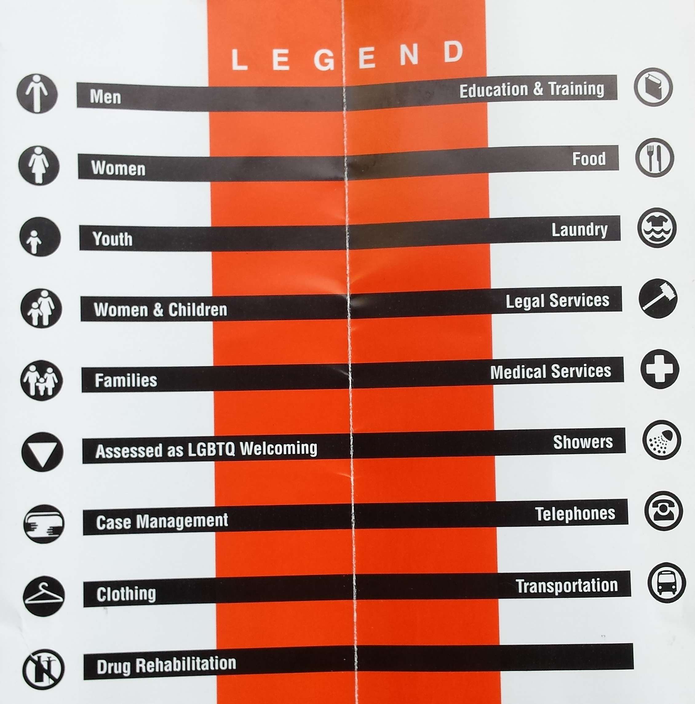
So men get training, women make food (or maybe the women are supposed to be the food?), you can launder your kids, the showers are gay-friendly, and drug rehabilitation leads nowhere? This is—how shall I put this?—not a triumph of graphic design.
Oh, well. At least the caseworkers appear to have phones.
Editor's Note: As of February 29, 2024, commenting privileges on reason.com posts are limited to Reason Plus subscribers. Past commenters are grandfathered in for a temporary period. Subscribe here to preserve your ability to comment. Your Reason Plus subscription also gives you an ad-free version of reason.com, along with full access to the digital edition and archives of Reason magazine. We request that comments be civil and on-topic. We do not moderate or assume any responsibility for comments, which are owned by the readers who post them. Comments do not represent the views of reason.com or Reason Foundation. We reserve the right to delete any comment and ban commenters for any reason at any time. Comments may only be edited within 5 minutes of posting. Report abuses.
Please
to post comments
I like that they lined up "showers" with "gay friendly".
Apparently "Bathhouses" was a bridge too far.
Maybe it's a Nazi reference
I get points for saying Nazi...right?
LGBTQ --------> Showers
You know who else led people he didn't like to the showers....
Captain Stabbin?
James Deen?
Jerry Sandusky?
No, he liked them. Really really liked them.
Linda Blair's warden in "Born Innocent?"
Norman Bates?
Bogs.
Women & Children... legal problems.
Sounds about right.
Transportation to the abortion clinic?
Yeah, bad graphic design, but I get it. It's just a list of symbols and what they mean. They didn't mean to link anything together, but the designer clearly has some college loans to pay off.
but the designer clearly has some college loans to pay off internet porn to return to viewing.
Naw, they block the porn, but can sure as hell spend all day shopping online though!
They had space to fill. Without changing much, you could interleave the 2nd page items, with their icons still right aligned, same basic idea with 50% less confusion in half the space. And I bet someone did exactly that, then everyone looked at the draft and was like "Hey, what about that empty panel?"
Easy, just fill w portrait photo of the administrator, or 2 admins.
I understand the legend perfectly.
It says that men need education and training.
Women need food.
Youth need their laundry done.
Women and Children need legal services.
And LGBTQ need showers.
And nobody needs drug rehabilitation.
The hanger is empty so shouldn't that be either nudity on the bus or roaming abortion services?
hangars:nudity::crucifix:Christ
discuss.
hangErs, even
I'm not a big fan of government either, but this is reaching pretty far. Could you really not find something better to criticize?
Do you know what Jesse normally covers?
Don't let perfection be the enemy of the good.
I agree with every point they make =
Men should tell everyone what to do; Women are for making food; children are for slavery-duties like laundry; if they refuse they should be punished by the courts; breeding requires frequent STD shots; gay behavior should be restricted to showers; always have a lawyer on speed-dial; keep your pants on while riding the bus; and rehab is for pussies.
A symbol for Women & Children. Why no symbol for Men & Children? Oh that's right, all men are child molesting scum.
I was kinda hoping the coathanger symbol was for "Family Planning Services".
"Launder your kids" reminds me of a TV commercial for Tide that spooked me when I was a kid. It showed a fully clothed boy & girl dropping into an operating washing machine. I found it online not long ago, and was surprised by how crude the matte shot looks to me now, but it was scary to me when it was on TV.
Other TV ads that scared me: Raid (big fascist can, as Robert Klein said), then later Autolite (sudden loud sound), still later anti-smoking PSA that had the cigaret go off like a gun while the smoker was driving. But I liked Bert & Harry Piels and Charlie The Tuna.
I see the pattern: alphabetic after the 1st 5. But hilarious that the 1st in the alphabetic sequence is so because of "Assessed"!
Changes the entire concept of those who can...do and those who can't ...well, just can't
I can hear the conversation now. We don't need no private graphics artist or advertising business expert intruding into our affairs - does anyone in the office know how to make a spreadsheet pie chart? The result is self evident.
It was designed by an SJW with an MFA in Renaissance Italian Gender Studies