The Look of reason
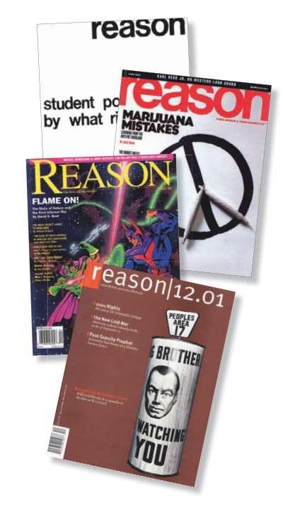
The first issue of reason consisted of seven typewritten, mimeographed pages. Over the years, the magazine got fancier, with photos replacing moody pen-and-ink sketches and color hitting the cover in 1979.
reason's most recent redesign hit newsstands in 2001. Orchestrated by then-Editor in Chief Nick Gillespie, Wired founder Louis Rossetto, designer Susanna Dulkinys, and eccentric font design phenom Erik Spiekermann, the fresh look switched the magazine from an off-the-shelf font to a typeface designed by Spiekermann himself, called Meta. The sleek, modern font, a "humanist sans-serif," is a far cry from the jagged typewriter strokes and the workhorse basics of the early years. We live in a world where the tools of individual expression, even typefaces, have grown ever more nuanced and accessible.
Senior Editor Brian Doherty says studying old issues for "40 Years of Free Minds and Free Markets" (page 28) gave him a "newfound respect and wistful nostalgia" for the look of the early days. The old issues "clearly didn't care what you thought about them. They did not try to tempt you, or win you over with frippery." The magazine's first editions rested on the power of their typewritten words alone, "which is something I hope and believe we have stayed true to," says Doherty, "even in our more attractively designed form."