Temperature Record Chicanery: An Overhyped Scandal
The real scandal is climate model failure

Welcome to the most policitized area of science: climate change research. Accusations that climate scientists are manipulating global temperature data in order to bolster claims for catastrophic man-made warming are flying thick and fast through the Internet. The latest round was set off by journalist Christopher Booker in his article, "The fiddling with temperature data is the biggest science scandal ever," over at The Telegraph. Unfortunately, such claims are given more credence since the infamous "hide the decline" emails were leaked during the Climategate fiasco.
In his article Booker is citing statistical work by climate change skeptic Paul Homewood who runs the science blog Notalotofpeopleknowthat. Homewood has analyzed changes made to temperature data series from weather stations in South America and the Arctic from Greenland east to Siberia. Those weather stations are part of the Global Historical Climate Network and are adjusted by NASA's Goddard Institute for Space Studies (GISS) to create one of the leading global temperature data series. Homewood notes that the raw data have been adjusted, which is not at all surprising since the data are affected over the decades by shifts in station locations, instrument changes, and urban heat islands.
Very generally, in order to detect such changes, climate researchers look for abrupt shifts in the temperatures recorded at each weather station which are presumed to be artifacts rather than actual temperatures. These shifts are adjusted via an algorithm using data from nearby stations. What Homewood found is that a lot of the past data have been modified in a mostly cooling direction. Lower past temperatures would produce a steeper global warming trend over the past century or so. No doubt the researchers who fear the consequences of man-made warming are greatly edified when their adjustments produce the temperature trend that they expect. Everyone is suspectible to confirmation bias. But scandalously suspicious? Perhaps not.
Let's forget the longer term global record for now. What do the main temperature datasets say about recent warming? The instrumental temperature records including the GISS dataset, the British HadCRUT4, and the NOAA NCDC find that average global temperature increased. GISS is the highest reporting a rate between 1951 and 2012 of 0.124 C° ± 0.020 per decade. NCDC finds the rate is 0.118 C° ± 0.021, and HadCRUT4 is lowest at 0.106 C° ± 0.027 per decade. The per decade trends for the period after 1979 is 0.161 C° ± 0.033 for GISS; 0.151 C° ± 0.037 for NCDC; and 0.155 C° ± 0.033 for HadCRUT4.
The period after 1979 is relevant not only because global average temperatures seemed to have jumped in the 1970s, but because the instrumental record can be compared to the satellite temperature record. Two groups process the data (a.k.a. "adjusted") from the NOAA satellites to produce separate records. As frequent Reason readers know I tend to follow the results from the University of Alabama in Huntsville. UAH climatologists who are quite skeptical of predictions of catastrophic climate change report that since 1979 the atmosphere has warmed at rate of 0.14 C° per decade. Using satellite data, the private research company Remote Sensing Systems finds that the atmosphere has warmed at an average rate of about 0.13 C° per decade. Interestingly, the RSS reports that the models most closely match the satellite temperature trends for the arctic region.
| Global Average Temperature Increase | 1951-2012 per decade rate | 1979-2012/14 per decade rate |
| GISS | 0.124 C° | 0.161 C° |
| NCDC | 0.118 C° | 0.151 C° |
| HadCRUT4 | 0.106 C° | 0.155 C° |
| UAH | 0.140 C° | |
| RSS | 0.130 C° |
To recap: All of the global temperature records find that the atmosphere has warmed in recent decades. The difference between the high and the low trends in the datasets since 1979 is 0.03 C° per decade. Summed over the past 35 years, temperatures have increased by at most 0.56 C° and at least by 0.455 C°, that is to say, a difference of about one-tenth of a degree Celsius. Additionally, it appears that global average temperature jumped to a new higher level in the late 1990s and has more or less "paused" since then. This is why so many climatologists repeat the mantra that the hottest years in the instrumental record have all occurred after 1998.
Nevertheless whatever suspect "adjustments" that may have been made they have barely changed the trend in any of the datasets.
In an effort to allay "hide the decline" concerns about how adjustments are made to raw temperature data, an international consortium of climatologists have suggested that the algorithms used to make the adjustments be benchmarked. Basically, the International Surface Temperature Initiative would generate synthetic climate datasets in which the "true" temperatures and the errors and discontinuities are both known. Then adjustment algorithms would be run against them to see which comes closest to reproducing the "true" dataset.
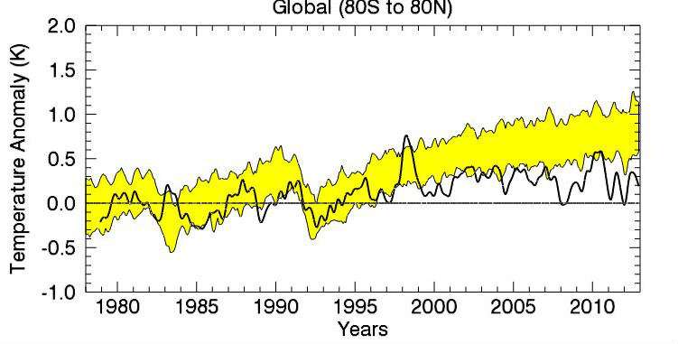
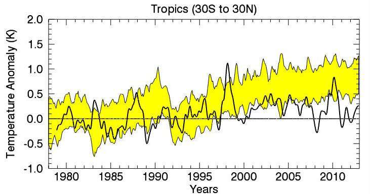
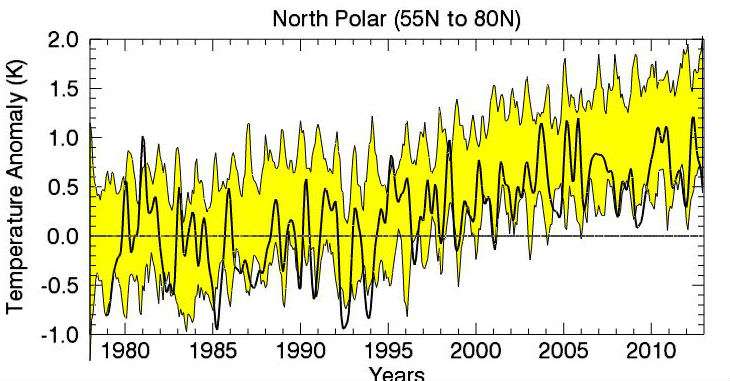
The real scandal, if there is one, is that nearly all of the climate computer models run hotter than these empirical trends. As the researchers at RSS observe, "Climate models cannot explain this warming if human-caused increases in greenhouse gases are not included as input to the model simulation." But the folks at RSS significantly further note, "The troposphere has not (emphasis RSS) warmed as fast as almost all climate models predict." To illustrate this last problem, RSS created the several plots below.
Each of these plots has a time series of TLT temperature anomalies using a reference period of 1979-2008. In each plot, the thick black line is the measured data from RSS V3.3 MSU/AMSU Temperatures. The yellow band shows the 5% to 95% envelope for the results of 33 CMIP-5 model simulations (19 different models, many with multiple realizations) that are intended to simulate Earth's Climate over the 20th Century. For the time period before 2005, the models were forced with historical values of greenhouse gases, volcanic aerosols, and solar output. After 2005, estimated projections of these forcings were used. If the models, as a whole, were doing an acceptable job of simulating the past, then the observations would mostly lie within the yellow band. For the first two plots (Fig. 1 and Fig 2), showing global averages and tropical averages, this is not the case. Only for the far northern latitudes, as shown in Fig. 3, are the observations within the range of model predictions.


RSS speculates that the models get it wrong because they fail to properly take into account things like volcanic aerosols, stratospheric cooling, and/or cloud feedbacks. Of greater possible consequence is that the models may be wrong on climate sensitivity - they estimate a bigger temperature response to a given level of carbon dioxide added to the atmosphere than may be warranted. And, of course, the models did not predict the current "pause" in global temperatures.
A final plea: Whenever you encounter information that confirms what you already believe, be especially skeptical of it.
Disclosure: I am not a member of "Team Hot" nor of "Team Not."

