Graph on Drug Overdose Deaths Highlights the Inconsistencies and Stupidity of the War on Drugs

Below is a graph put together by Kaite Peek over at Popsci:
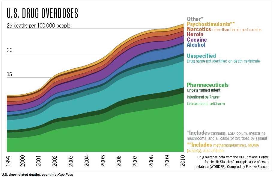
The graph charts the number of drug overdose deaths in the U.S. from 1999 to 2010 using data from the Centers for Disease Control and Prevention's WONDER database. A few things to note:
- The graph puts methamphetamines, MDMA, and caffeine in the same group (Psychostimulants).
- Marijuana and LSD only appear in the "Other" category (the tiny grey section at the top, which also includes opium, mescaline, mushroom, and overdose by assault).
- The article below the graph includes a few caveats:
…if a person had multiple drugs listed on their death certificate, they're being counted twice here. Also, the database doesn't include nonresidents—either undocumented immigrants or U.S. citizens living abroad.
Despite grouping caffeine with meth and some data collection issues (potentially counting some people twice), the graph does a pretty good job of highlighting the fact that American drug policy is not motivated by a desire to reduce harm. Were American policies towards dangerous substances motivated by desire to reduce the number of deaths alcohol and cigarettes would be prohibited and regulations on pharmaceuticals would change.
Watch Nick Gillespie discuss the war on drug with Stephen Colbert here and read more from Reason.com on the war on drugs here.