Welcome to the New Reason
When Lanny Friedlander assembled the first issue of Reason in a bedroom in his mother's house in 1968, he was working with a limited budget and an even more limited set of tools. The name of the magazine was applied using Letraset press type—each black letter painstakingly transferred from a transparency onto the cover by rubbing the back of the page with a rounded stick or a ballpoint pen. Helvetica, the type he picked, is now so famous and fetishized that there's a cult-hit documentary about it. At the time, the choice was revolutionary. The rest of the text was executed on IBM compositor typewriters and copies were run off on a mimeograph machine, because that's all Reason could afford. Subscription labels were hand-addressed.
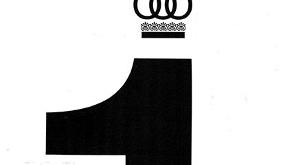
Within those limitations, perhaps even because of them, Friedlander wound up making bold choices that continue to inform Reason's look and feel. His selection of Helvetica and the simple, open, text-based aesthetic (see, at left, the sovereign singular numeral that adorned the cover of the September 1975 issue) were in keeping with the International Typographic Style of graphic design then popular at MIT Press, where the Boston-based Friedlander liked to hang out. The Swiss grid, as the style is also known, with its emphasis on rationality and objectivity in presentation, was an obvious choice for a fledgling Objectivist magazine, but an inspired one nonetheless. In fact, the "form follows function" aesthetic is so baked in to modern style that it's nearly invisible to today's casual consumer; it dictates the look of everything from retail websites to the menu at that hot new restaurant in your neighborhood.
Here's what Reason got right from its very first issue: Instead of trying to compete with top-of-the-market mainstream glossy magazines, Friedlander served up a cheap product with almost no bells and whistles to a segment of the market previously disregarded for being too small, too weird, too low-margin, and too hard to reach. This, in a nutshell, is the concept of disruptive innovation, a term coined by Harvard Business School professor Clayton Christensen in 1995. The phrase is now so commonplace in business bigthink that it has become a PowerPoint cliché. As applied in the for-profit world, it's one part inspiration for entrepreneurs (look for the untapped niche, the underserved market, the problem that you can solve to get your foot in the door) and one part cautionary tale for incumbents (while you're busy offering an ever-increasing slate of expensive premium services and add-ons, better watch your back for the scrappy upstart creeping up on your market share). Reason's quirky philosophy, simple look, and disconcertingly direct sell were a classic case of disruptive innovation, decades avant la lettre.
Our task, in redesigning Reason, was easier than Friedlander's in many ways. Every hour of every day, millions of robots scramble to assemble and label photos and images for us to choose from. Contacting photographers, artists, and writers in Johannesburg or Bangkok is only a moment's work. When we set out to choose our new typeface, Art Director Joanna Andreasson was afloat in a sea of typographic options.
Necessity is the mother of invention, but abundance can be too. In a world where nearly everyone was hungry all the time, Henry VIII's girth (and gout) were status symbols. But when everyone can feast on overstuffed steak burritos, the rich stay thin. For most of history, the only thing scarcer than printed matter was educated, free people with enough leisure time to fill those pricey pages. Reason is a child of plenty, and one response to profusion is to experiment with empty space. Not every inch of every page needs to be dense with data when printing is cheap and information is everywhere. Instead, the goal becomes finding ways to make the consumption of that novel information pleasing and memorable.
With over 4 million visitors a month to reason.com and 2.5 million views of our videos on YouTube and Facebook, our metaphorical printing presses are running 24/7. That gave us the chance to rethink what content ends up in print and why. We've chosen to move away from the 24-hour news cycle—which is already being ably dissected on our website every day—and toward fresh reporting, narrative writing, and timely analysis, all with the staying power to survive the comparatively long print production process. We've expanded our stable of columnists and created places for some of Reason's favorite writers to make regular contributions you wouldn't find anywhere else: Former editor Virginia Postrel is returning to our pages with a history-focused column, plus economist Deirdre McCloskey, Free-Range Kids founder Lenore Skenazy, and contributing editor J.D. Tuccille. The redesign will also showcase more frequent contributions from our resident legal eagle Damon Root and drug policy aficionado Jacob Sullum, alongside new criminal justice reporter C.J. Ciaramella.
Readers can expect to see more articles that will remind them of Reason's early days, when the moral case for markets was front and center and the magazine looked to aggregate and parse trends in politics and policy making into a coherent narrative once a month. But Reason will also be drawing on Postrel and Nick Gillespie's legacy of integrating coverage of culture and tech with our political writing, with the goal of giving a more complete picture of the world than our partisan competitors typically muster.
The beating, bloody heart of the magazine will continue to be long-read features, of course, but we'll also break up the feature well with infographics. And many issues, beginning with this one, will be anchored by in-depth interviews and high-quality photoshoots showcasing superstars in the libertarian universe, intended to humanize and personalize the ideas we engage each month.
We chose not to embrace the industry trend toward short superficial treatments of serious subjects and advertorial-style layouts. Instead, we sought to make the magazine more visually engaging while still keeping our substantive, principled content at the center of our design.
The magazine you're holding isn't a finished product. By doing the redesign in-house, Andreasson was able to blend her own layered, pattern-driven, post-modern design sensibility with Reason's 20th century visual vocabulary to meet the magazine's specific needs, creating a living template that will continue to grow under her capable direction. She will also draw from a large, fresh pool of freelance illustrators and photographers to give each feature story a unique feel. Occasionally we'll even be blowing up the whole thing, so keep an eye out for some odd-looking special issues in your mailbox in the coming months and years, and eventually for changes to all of Reason's properties.
Reason remains a relatively scrappy nonprofit publication, but we are nonetheless almost unimaginably rich in design resources and writing talent. And even after nearly five decades, we are still creeping in from the bottom, expanding our share in the marketplace of ideas, and—in a time when the rhetoric of the dominant players is increasingly distasteful and unappealing—offering a refreshingly simple alternative way to look at politics and culture, through the lens of free minds and free markets.
We hope you like the magazine you're holding in your hands, and that you'll join us each month as we make something smart, weird, and disruptive.